App Reference
- The AirSmart App at a Glance
- "I want to sign in"
- "I want to see my devices my way"
- "I want to look at one device closely"
- "I want to add a new monitor"
- "I want to be told when something's up"
- "I want to share a device with someone"
- "I want to record work I've done to the property"
- "I want to change how the device looks"
- "I want to organise my devices into groups"
- "I want to share lots of devices at once"
- "I want a report"
- "I want to change my account, or get help"
- Web Portal
The AirSmart App at a Glance
The AirSmart app has had a big refresh, so if you've used it before, a few things have moved around (for the better, we hope!). Here's the whole app in three pictures: all your devices on one screen, a summary for any device, and a deep-dive into any single reading.
You can find the app on the App Store or the Google Play Store by searching for "AirSmart" or "Monkeytronics". It's free, takes up barely any space on your phone, and sips data. The app is organised into five tabs along the bottom of the screen - Devices, Groups, Reports, Settings and Sharing - and we'll walk through each of them below as a set of quick "how do I…?" stories.
PRO TIP
Use the QR code on the quick start guide to download the app.
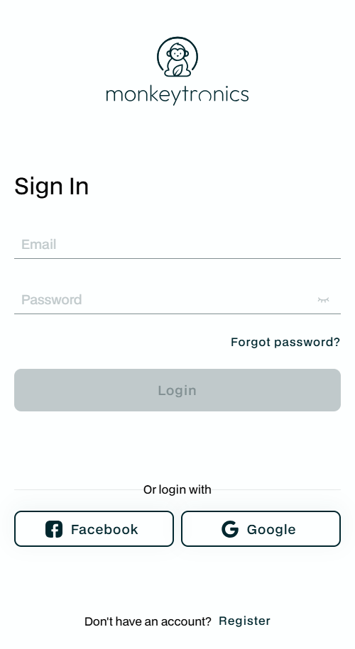
"I want to sign in"
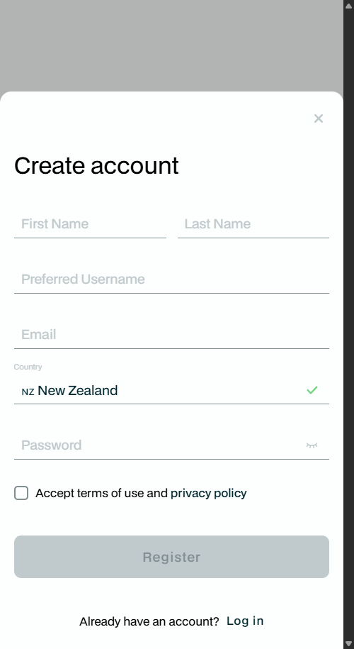
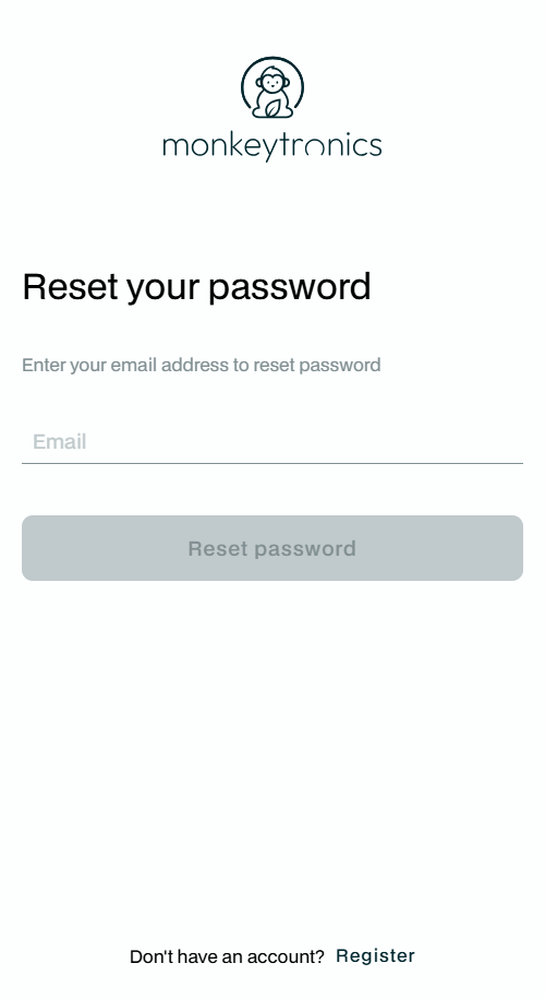
First time in, you'll meet the splash screen and then the sign-in page. No account yet? Tap Register, fill in the short form, accept the terms, and you're away (you can use Facebook or Google too). Forgot your password? Tap Forgot password? and we'll email you a reset link - if it gets caught by a spam filter, just give us a yell.
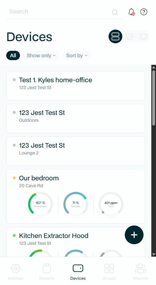
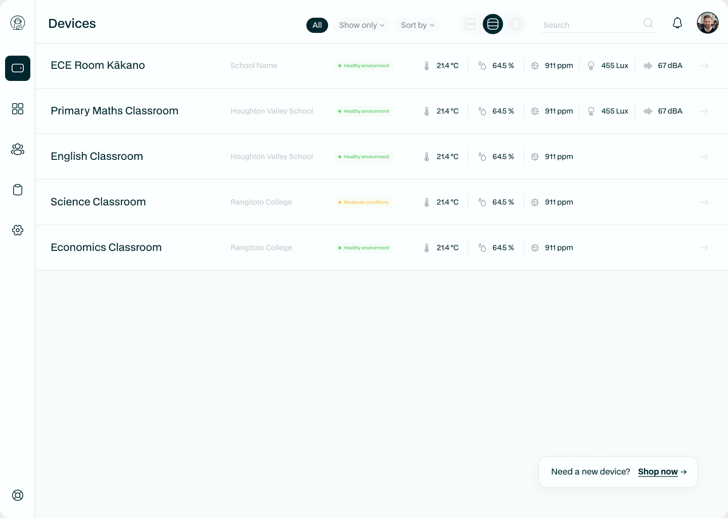
"I want to see my devices my way"
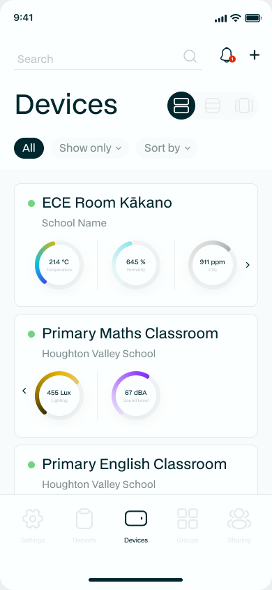
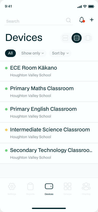
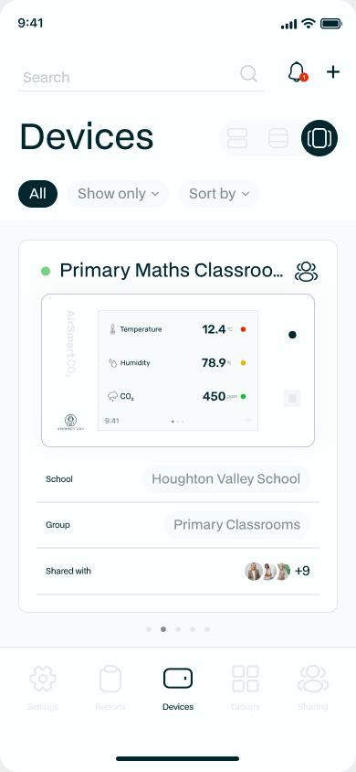
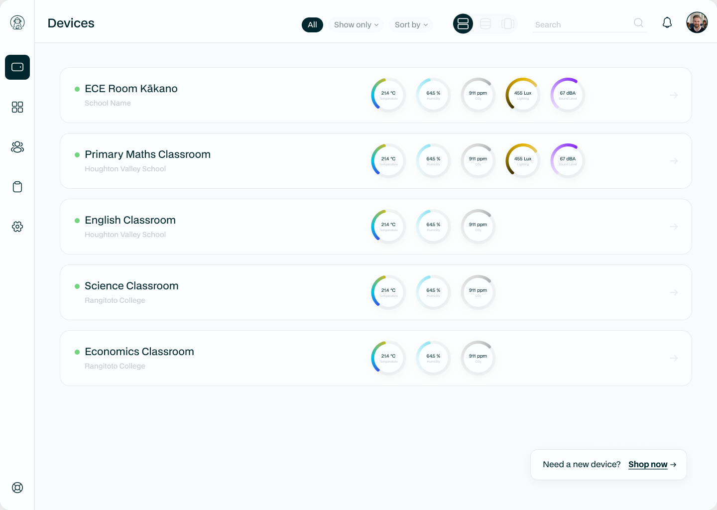
The Devices tab is home base. Everyone likes to read a wall of devices differently, so there are three ways to view them - tap the view selector at the top of the page to switch between them:
- Cards - big, friendly dials for temperature, humidity and CO₂ at a glance.
- List - compact rows when you've got a lot of devices to scan.
- Slider - swipe through one device at a time.
The search box and the Show only / Sort by controls work in every view.
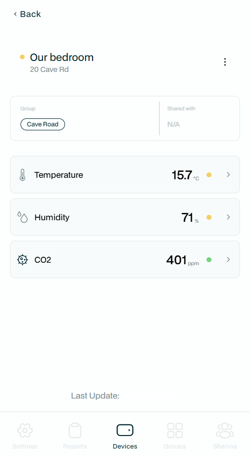
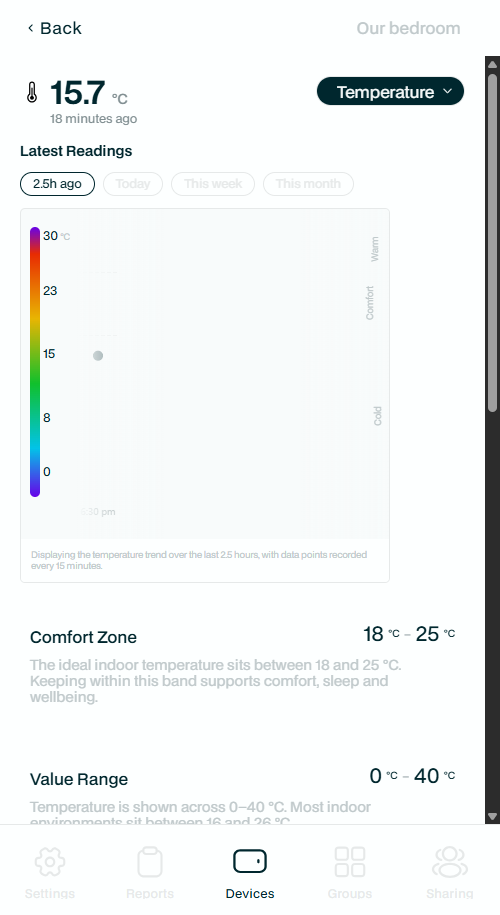
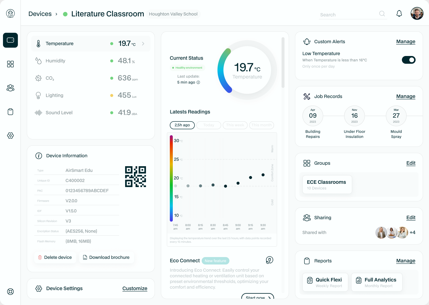
"I want to look at one device closely"
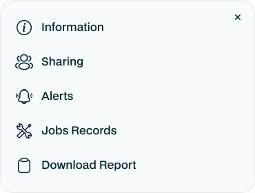
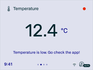
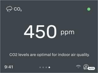
Tap any device to open its summary - the live readings, the group it's in, and who it's shared with. Tap a reading to dive into the detail page, which is where the app really earns its keep: a trend chart, the comfort zone explained in plain English, today-versus-yesterday, and how much of the time you've spent in the green. Tap the device name at the top to open the device menu, your jumping-off point for everything to do with that one monitor.
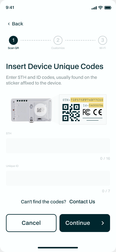
"I want to add a new monitor"
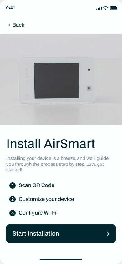
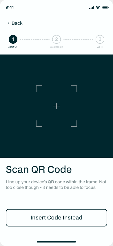
On the Devices tab, tap + to start the three-step Add Device wizard: scan the QR code, customise the device (name, room, group), and done. The app then walks you onto Wi-Fi.
NO CAMERA? NO PROBLEM
If your camera is playing up or the QR code is scuffed, tap "Can't find your codes?" and type the device's STH code and Unique ID in by hand - both are printed on the device and on the box.
To get a device onto Wi-Fi (now or later), choose Wifi from the device menu, then press and hold the red button on the back of the monitor to put it into pairing mode. The app connects over Bluetooth, scans for networks, and lets you pick yours and pop in the password.
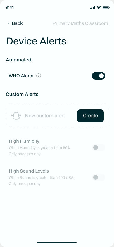
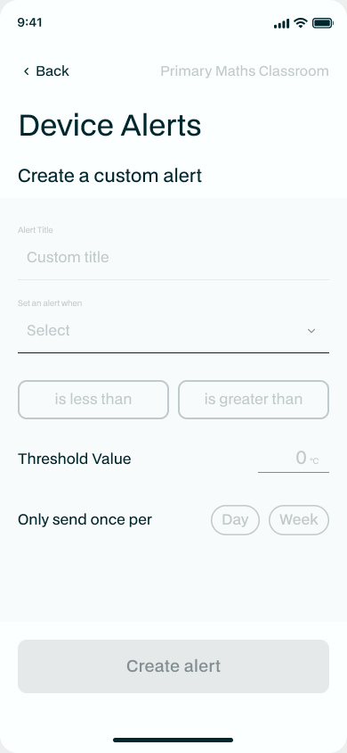
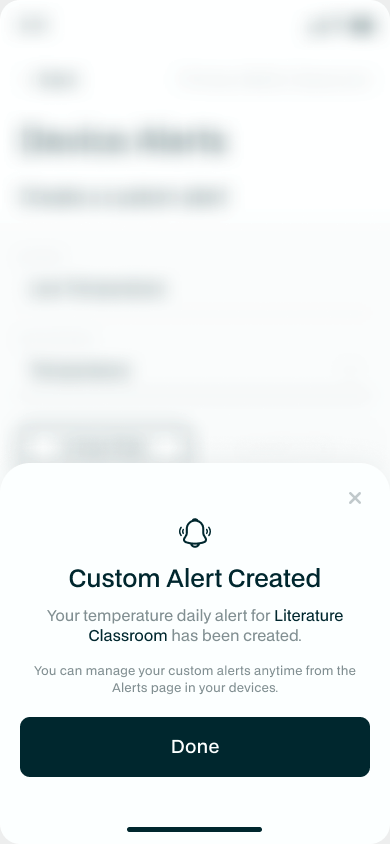
"I want to be told when something's up"
Open Alerts from the device menu. Flick on the CEN Automated Alerts for a ready-made, risk-based set developed with the Community Energy Network, or build your own: tap Create, choose the measurement, the operator and the threshold, and how often you'd like to hear about it. Your active alerts sit below, each with its own switch.
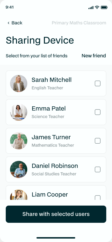
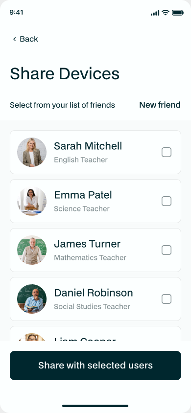
"I want to share a device with someone"
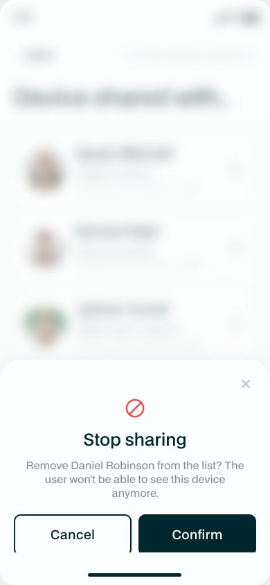
Want family or flatmates to see the data? From the device menu choose Sharing, tap Share Device, pick the person (they just need a free Monkeytronics account), and they're in. You can see who a device is shared with, and stop sharing any time - the other person only ever gets to look, never to meddle with your settings.
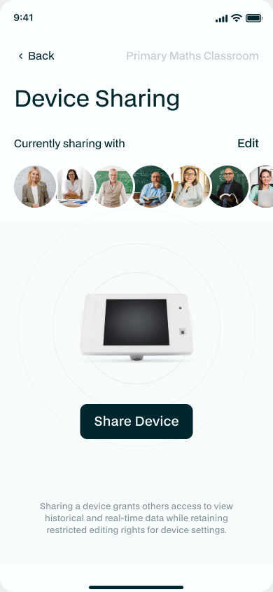
PRO TIP
Only the device owner can share a device. If someone shares one with you, you can't pass it along to a third person.
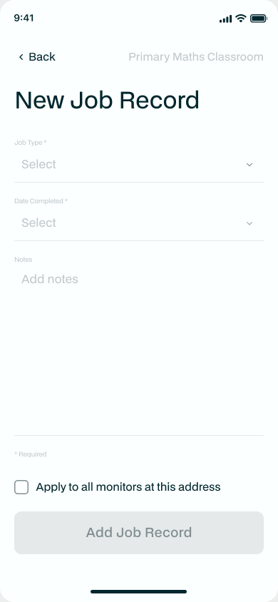
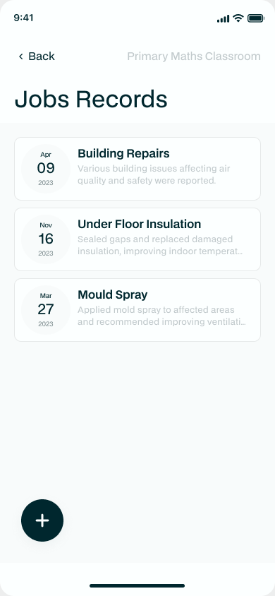
"I want to record work I've done to the property"
The Jobs page (in the device menu) is a little logbook for your property - a new heat pump, some insulation, a repair. Tap +, jot down what you did and when, and it's saved. It's not just for your records: the reporting engine uses these to do proper before-and-after analyses of an upgrade and its impact.
"I want to change how the device looks"
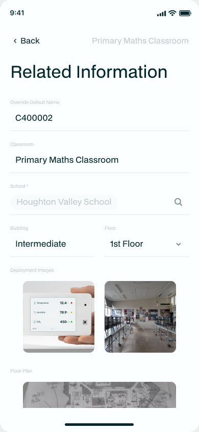
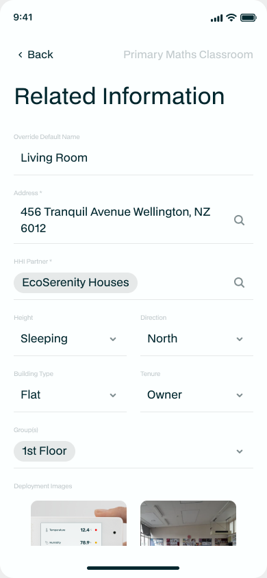
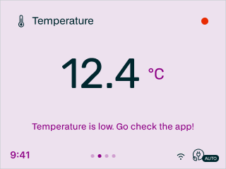
Each monitor's on-screen display is yours to tweak. In Device Settings (from the device menu) you can pick the screen colour scheme - lighter or darker, whatever's easiest to read on the wall - and set the text scale. The project fields below adapt to whether you're a home or a school user, so you only ever see what's relevant to you.
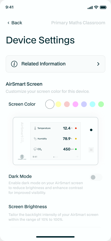
Here's the same monitor wearing a few different looks. Pick a light colour scheme that suits the room, or switch to dark mode so the screen is easy on the eyes in a dim space:
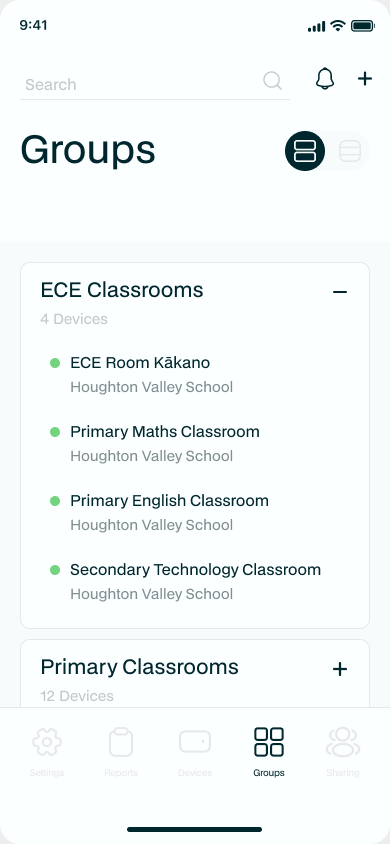
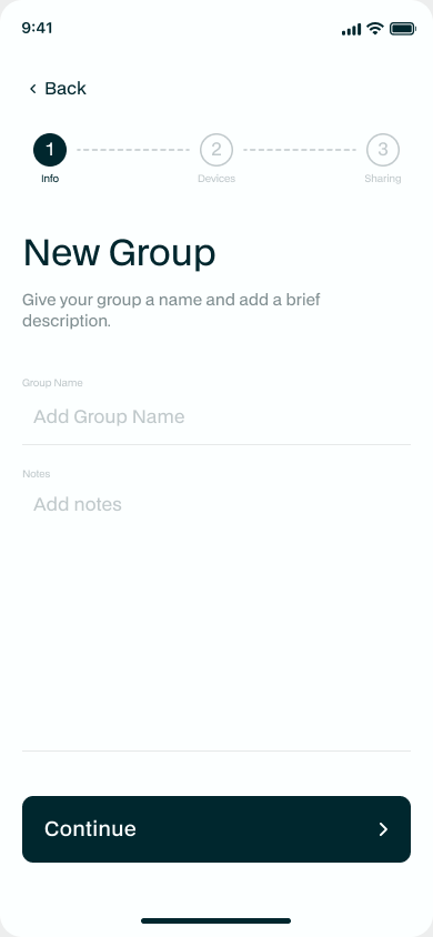
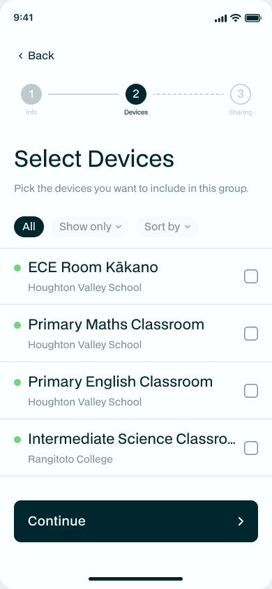
"I want to organise my devices into groups"
The Groups tab lets you bundle devices however suits - by site, by project, by building. Tap + to create one, give it a name and description, then choose the devices to include. Once a group exists you can filter your Devices tab by it and, more powerfully, segment your reports by it.
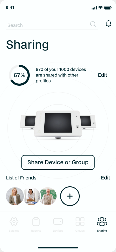
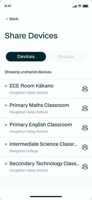
"I want to share lots of devices at once"
The Sharing tab is the big-picture version of sharing. The dial up top shows how much of your fleet is currently shared. Tap Share Device or Group, choose what to share, and pick a friend from your contacts. It's the quickest way to give someone access to a whole bunch of devices in one go.
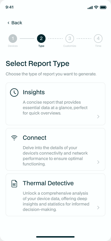
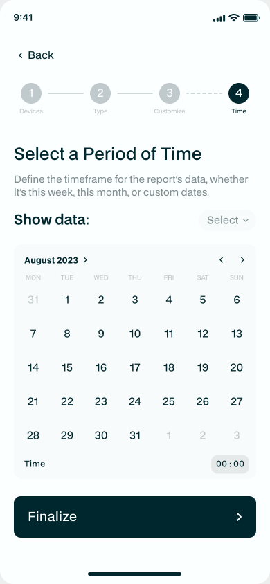
"I want a report"
The Reports tab builds a report in four steps: choose the devices (or a group), pick the report type (Quick, Connectivity or Full), customise which sections to include, and set the period. Hit go and it's queued in the cloud, where a dedicated Analytics Server crunches the numbers and emails you the result. A Full report can include a deployment map plus room, tenure, building-type and height analyses - and you can segment any of it by your own groups.
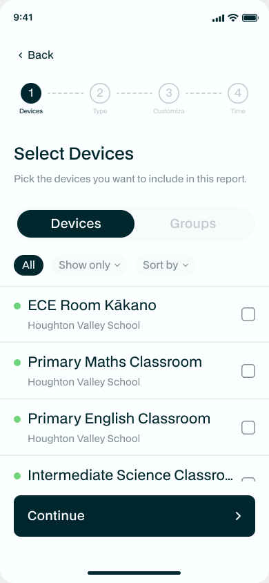
PRO TIP
Groups are the secret to powerful reporting. Include all your devices in a report, then in the customise step choose "Analyse [your group]" - you'll get a whole section broken down by that group, so you can compare one set of devices against the rest.
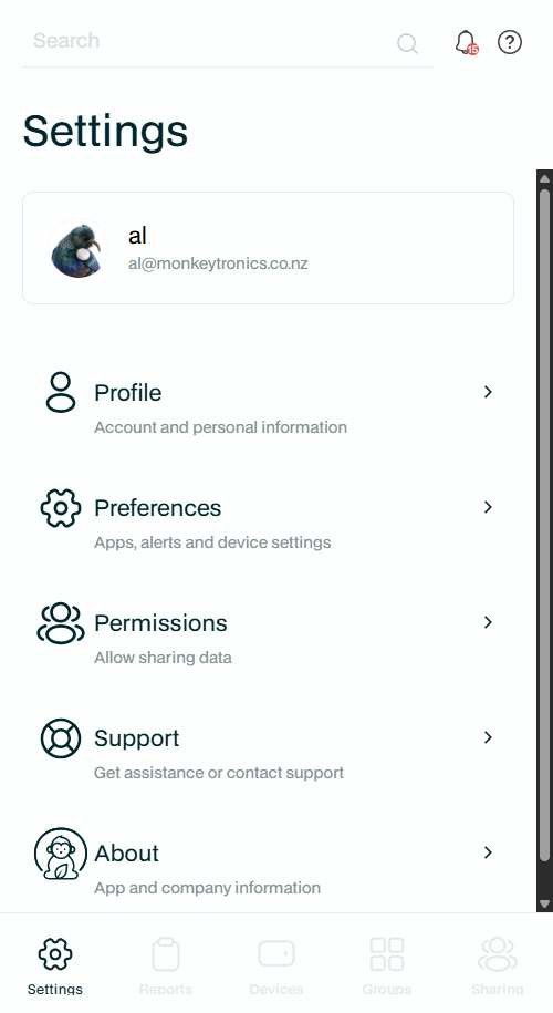
"I want to change my account, or get help"
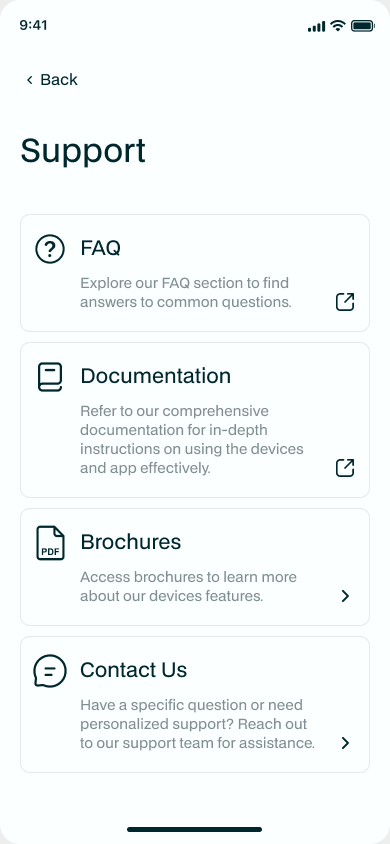
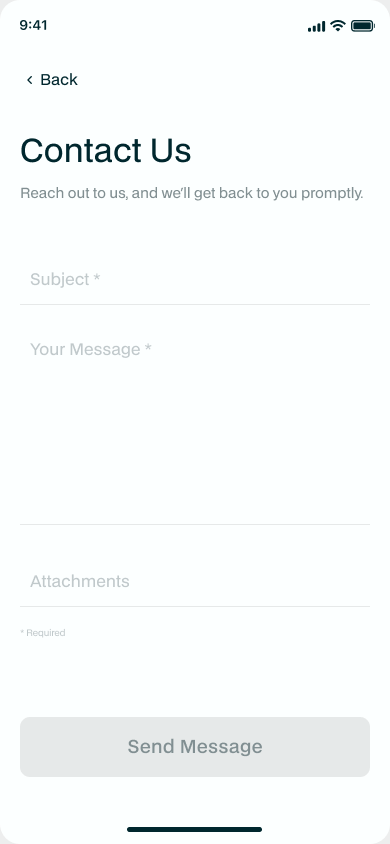
The Settings tab holds everything about you and the app - your Profile (change your username or password here), Preferences, Permissions, and About. The Support page is your direct line to us: browse the help, download a product brochure, or send us a message with the contact form.
Web Portal
Alongside the app, Monkeytronics also provides a full-featured Web Portal for advanced and organisation users with lots of devices. It's a more powerful visualisation and reporting tool - risk pie charts across your whole portfolio, a sortable device table, a signal-strength overview, and the same rich filtering and reporting you get in the app, with more room to move on a big screen.
PRO TIP
The AirSmart Web Portal is available on any browser at https://data.monkeytronics.co.nz. You'll still need the app to add new devices, but everything else can be done from either place.