App Reference
Mobile App
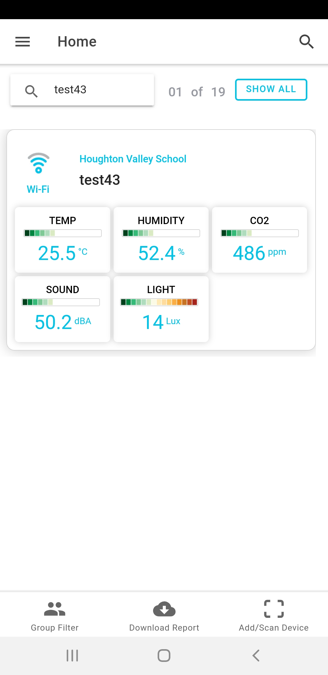
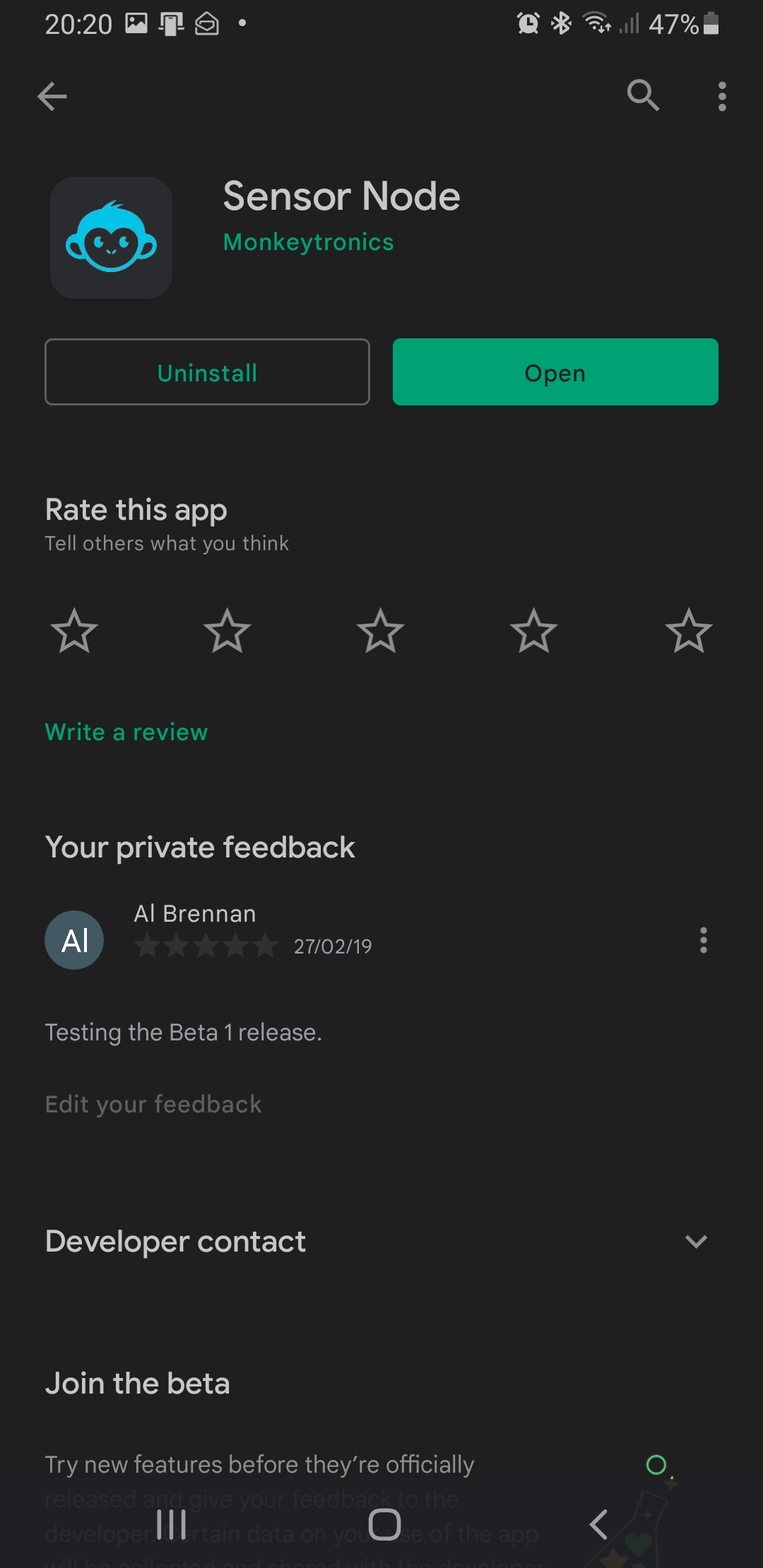
You can find the app on the App Store or the Google Play Store by searching for "Sensor Node" or "Monkeytronics". It's free to download. The mobile app consumes a tiny amount of space on your phone, and uses a minuscule amount of data from your contract. We understand that data isn't free, so we go easy on it!
The mobile app is designed for day to day use to keep an eye on how your classroom or school is performing. It's perfect for monitoring up to 20 devices. If you have more than that, you may want to consider using the web portal.
PRO TIP
Use the QR code on the quick start guide to download the app
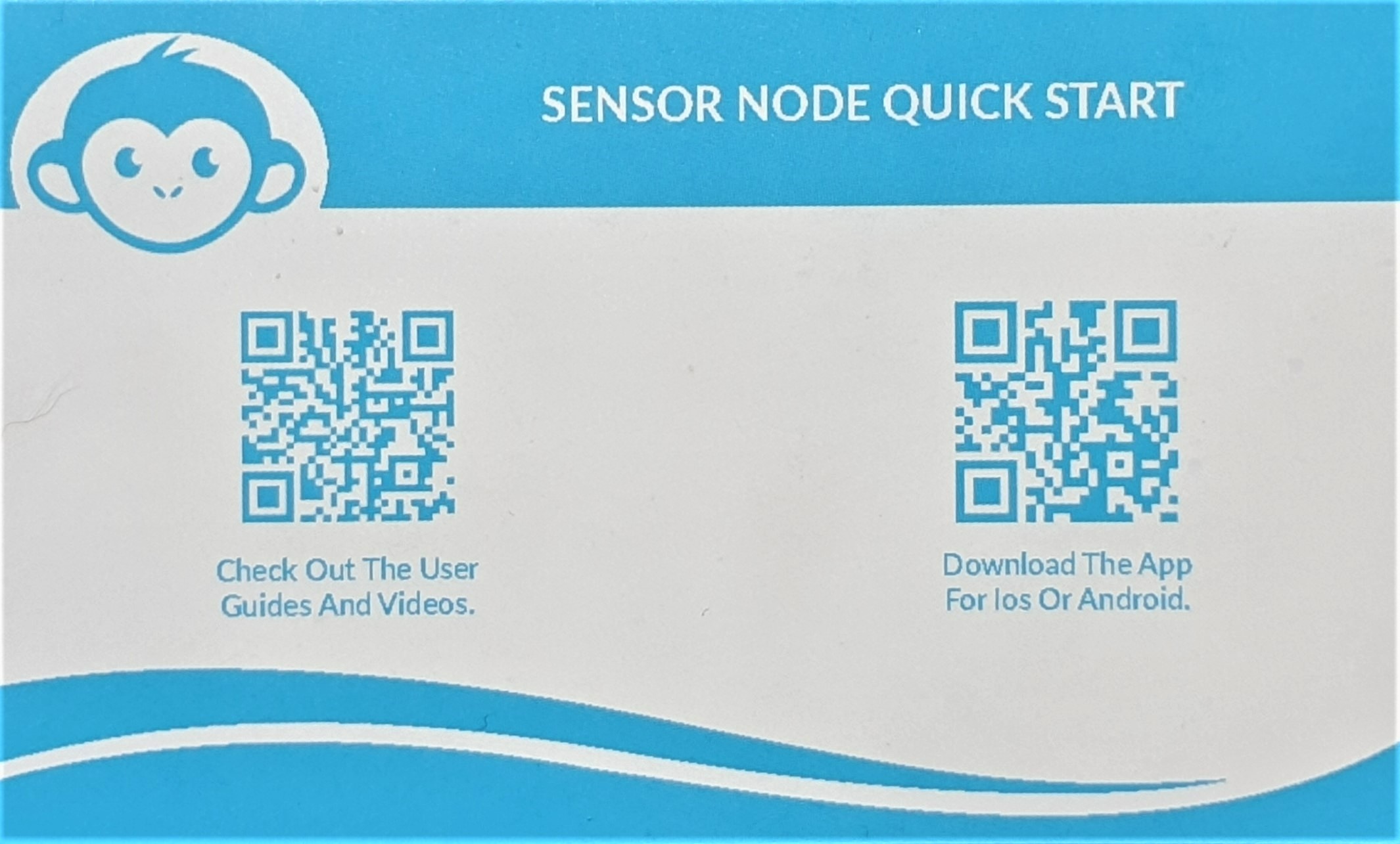
Figure : User Guide - QR codes
Web Portal
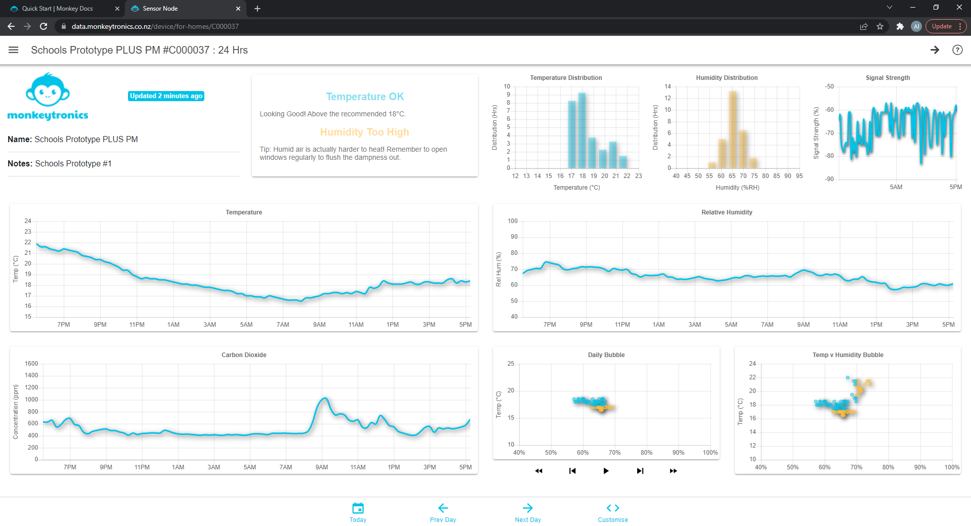
Figure : User Guide - QR codes
The Web Portal is an essential tool for advanced or organisation users with heaps of devices.
PRO TIP
The Sensor Node Web Portal is available on any browser at https://data.monkeytronics.co.nz
Getting Started
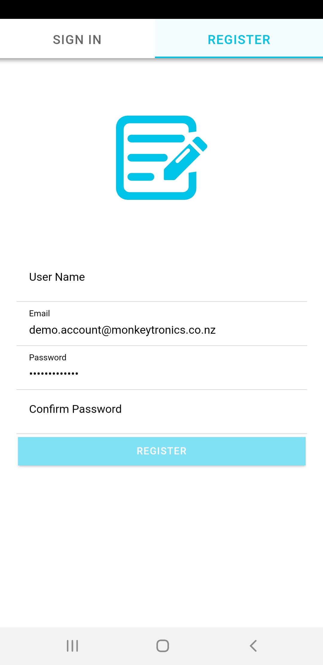
Register Your Account
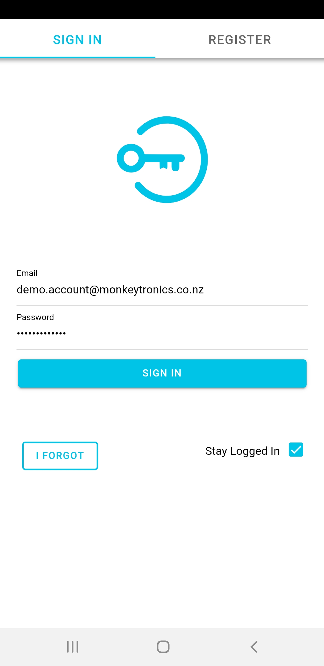
The first time you open the app, you will need to register an account. You will receive a confirmation email. Then you're good to sign in.

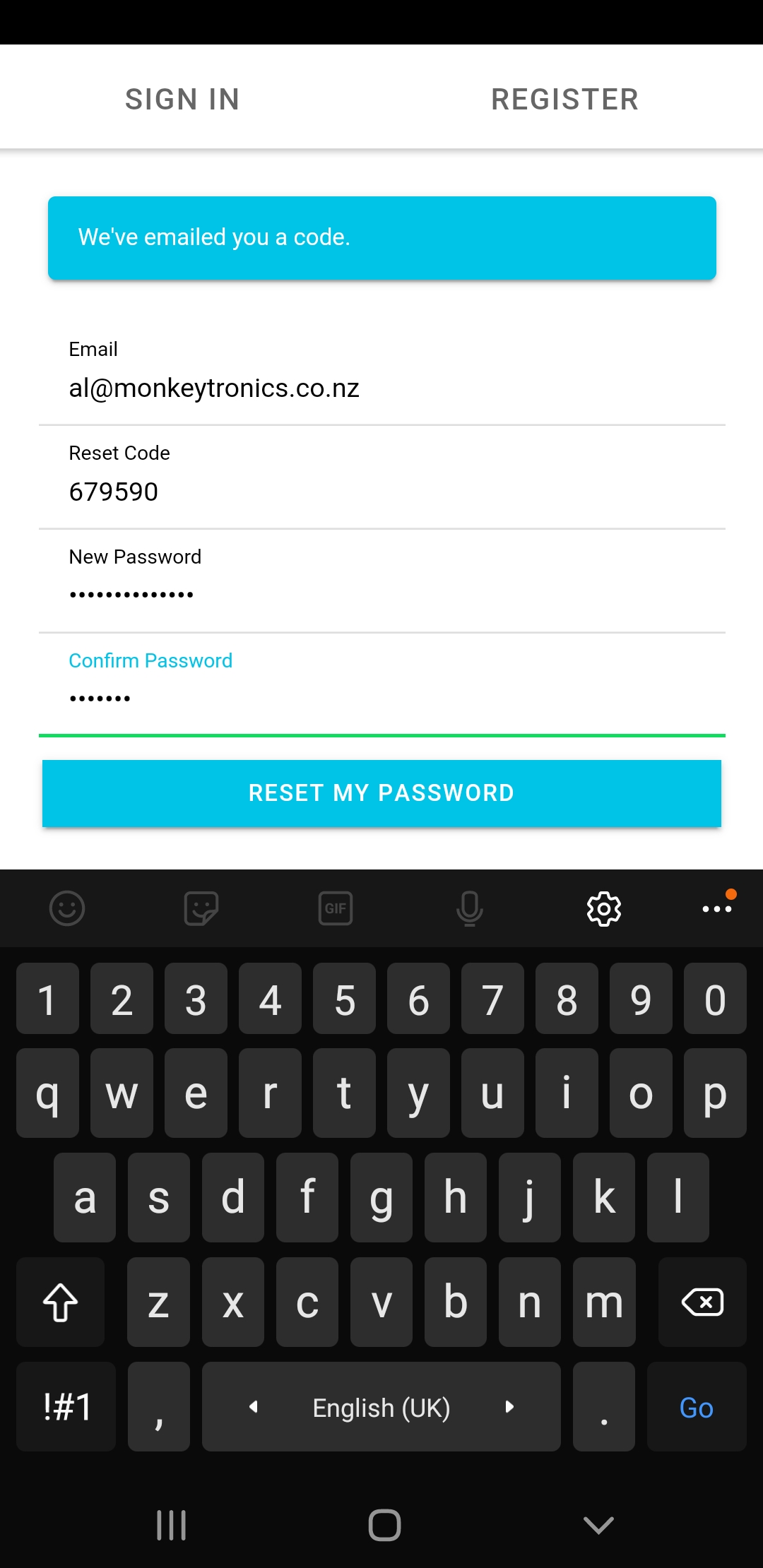
If you Forget Your Password
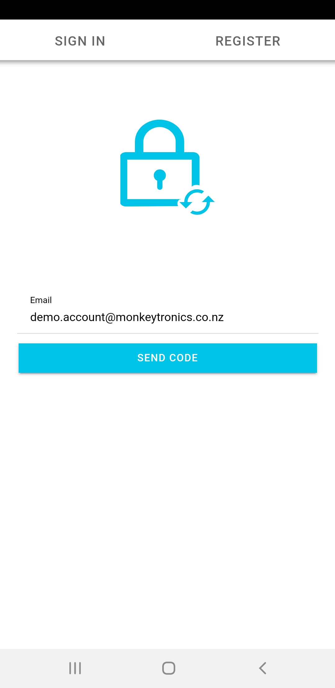
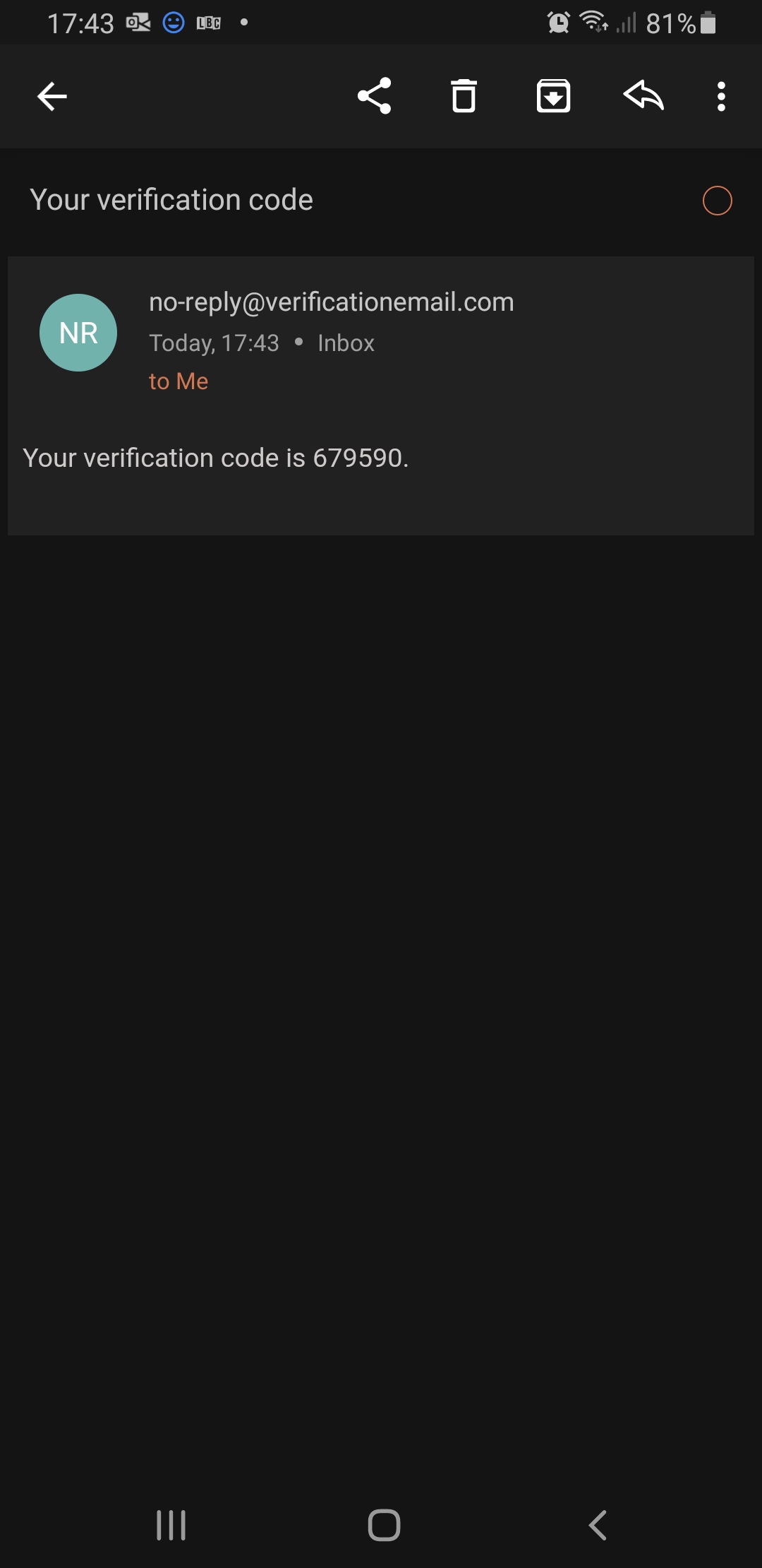
If you forget your password, follow these steps. If you have any issues retreiving the new password code because of email filters etc, don't worry! We can help you get up and running again.
Managing Account Settings
Change Your Password or Username
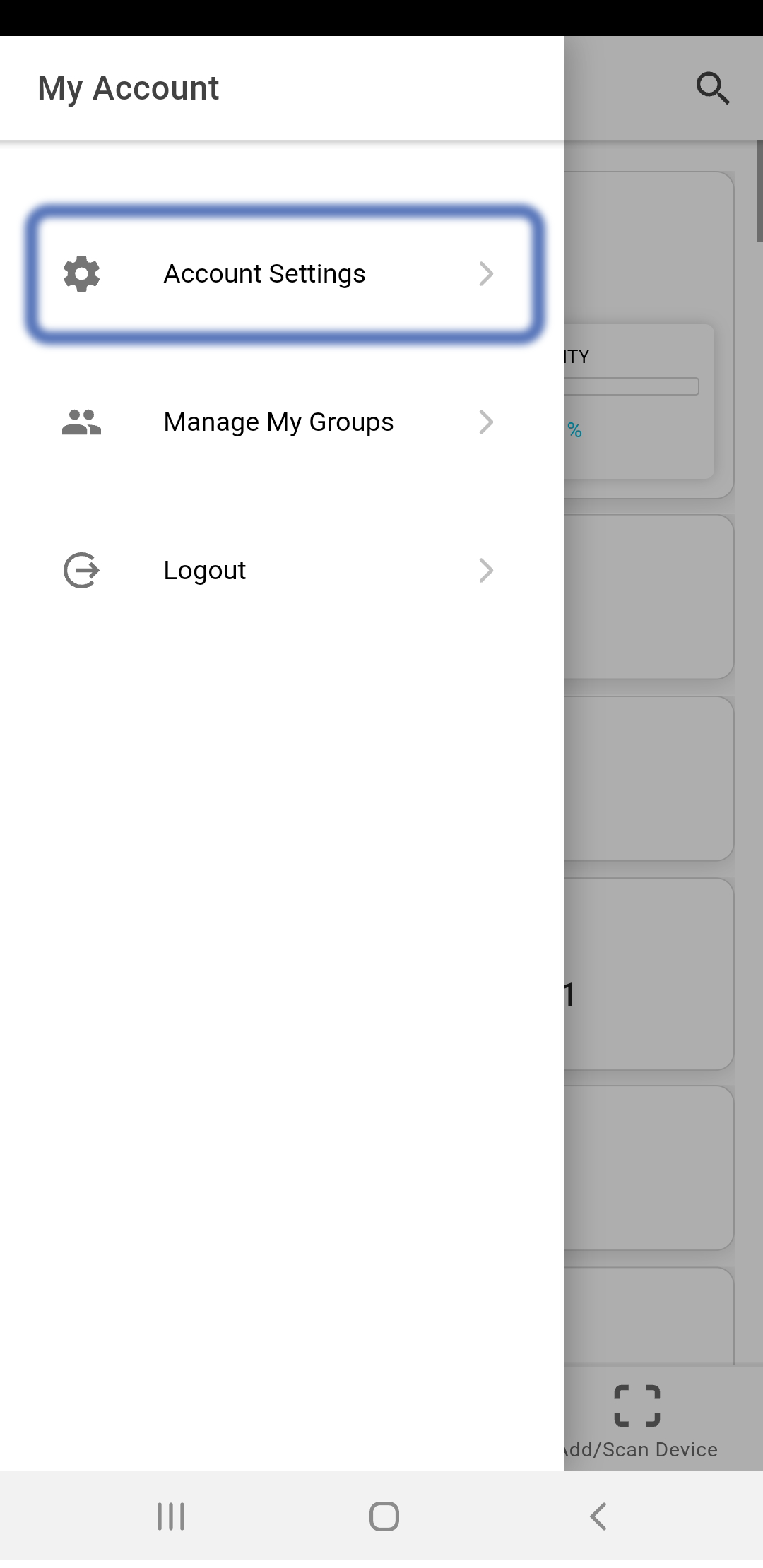
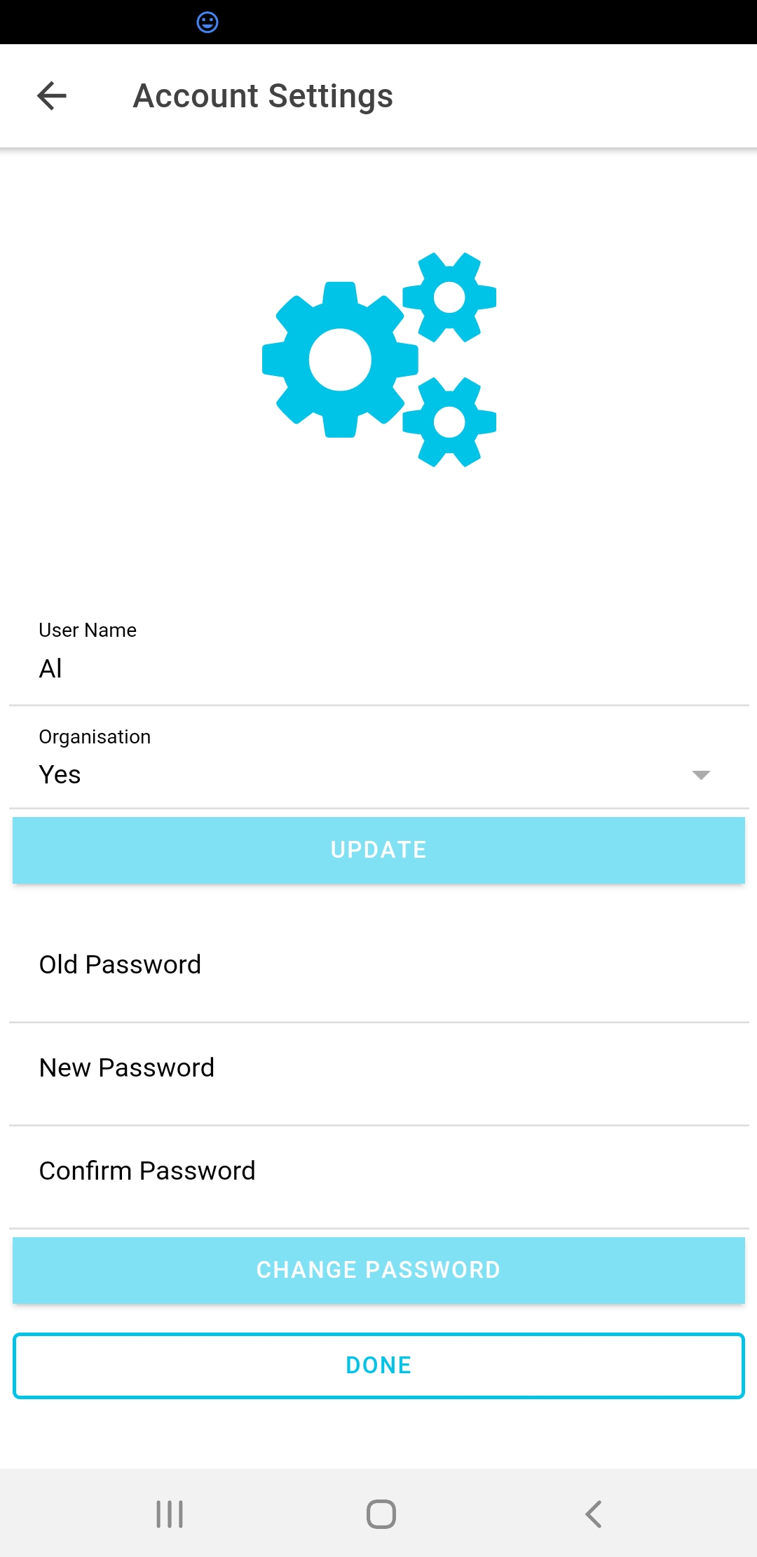
You can change your Password or Username at any time from the Account Settings page. From the Home page, access the ≡ menu and select 'Account Settings'. Changes take effect after you click the 'update' or 'change password' button.
Organisation Setting
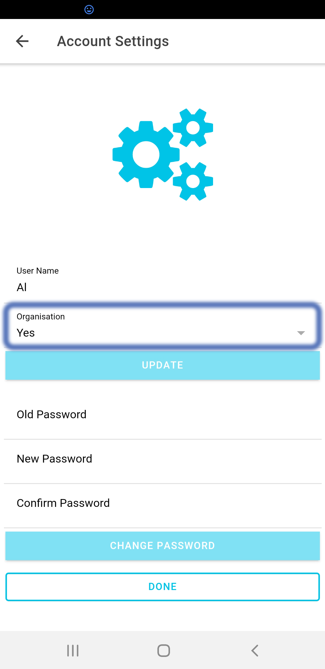
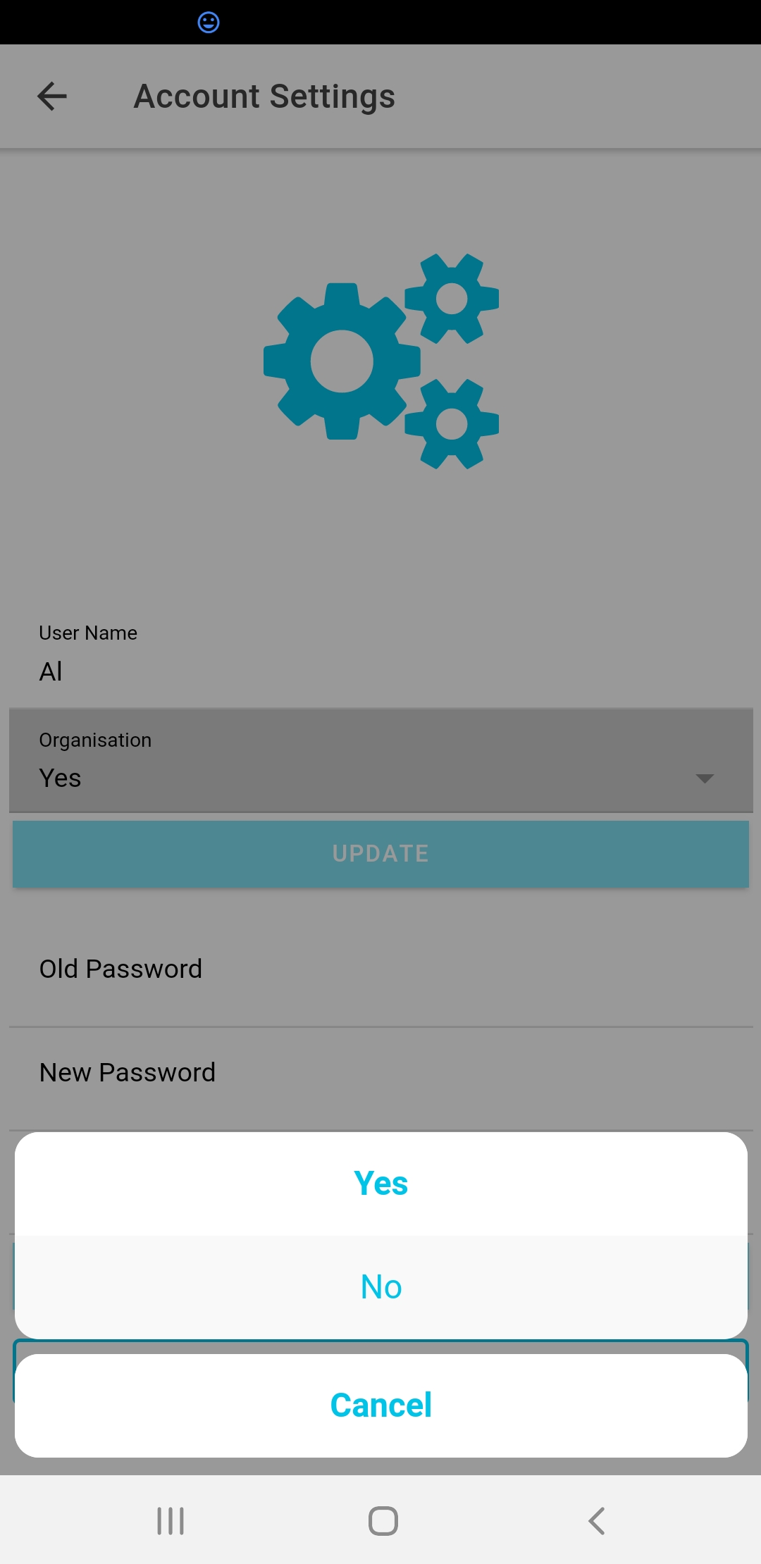
You can also change your Organisation Setting. When you set up your account as an organisation, all the more advanced functions are enabled such as analytics reporting and full project settings for your devices. But even if you're just monitoring a single classroom, you may find some of these features interesting so why not give it a go?
PRO TIP
Full access to app features is only available for 'organisational users'. If you want to use these more advanced features, you need to select this option in the Account Setting ≡ menu.
The Mobile App Home Page
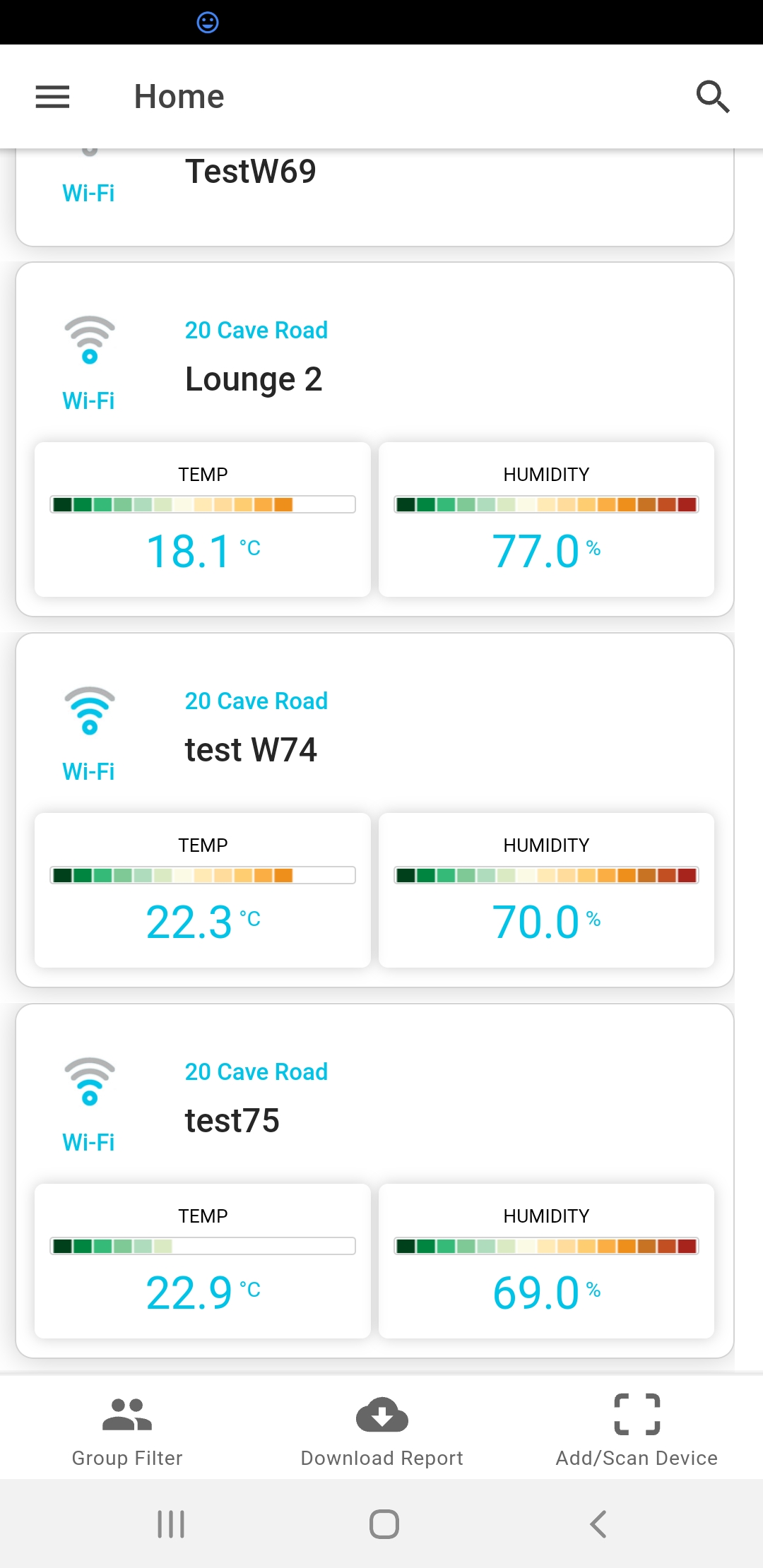
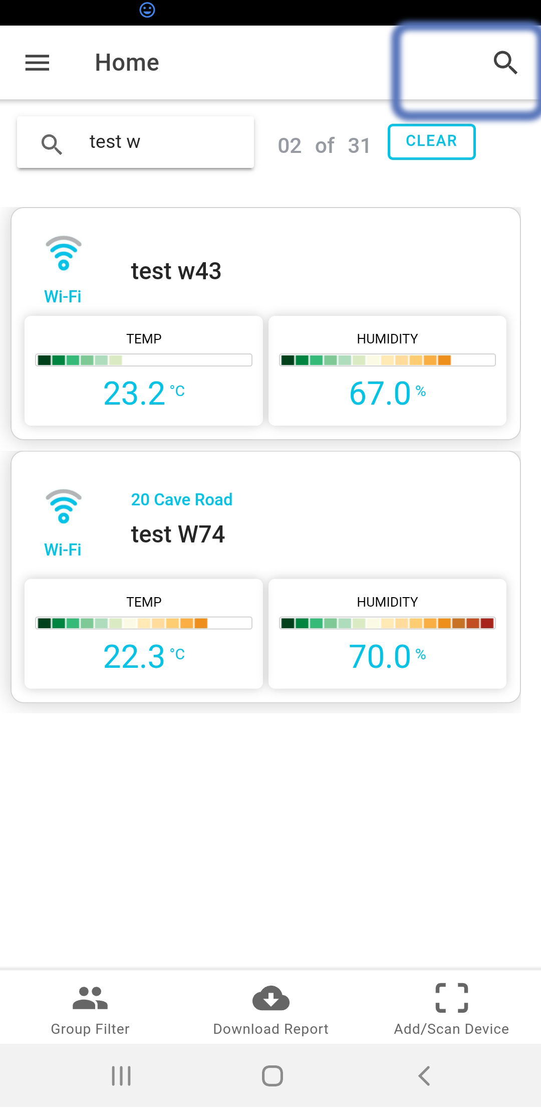
The mobile app home page shows you a snap-shot of your devices, with last readings and a status bar to indicate whether the readings are in the comfort zone or not. You can search or filter the selection using the search bar. Click the search icon and type in your filter. Only devices which match the filter text will remain in your selection. The filter looks for matching terms in the device name, notes, classroom, school, device id and group fields.
The Web Portal Home Page
The web portal is a much more fully featured visualisation tool. There are lots of great features:
- The risk pie charts tell you what proportion of your device portfolio is currently experiencing poor temperature and Carbon dioxide performance.
- The signal strength chart tells you what the connectivity is like across your entire portfolio.
- In the device table in the centre of the page, you can sort your results by any of the fields. Just click on the column header. Click again to reverse the sort direction.
- You can see the Alert Score in the last column. This is a metric which was developed in collaboration with He Kainga Oranga as an indication of health risk in a living space. It is based exclusivley on the temperature over time and the numeric value should be interpreted as the number of degrees celcius hours below 18 per day.
- Some pages include a short help pop-up which provides more information about the contents of the page. Please take a minute to check these out.
The last and probably most important feature to discuss in the webn portal is the device filtering. If you only want to see devices which are currently 'at risk', just click on that segment of the pie chart. This will apply a filter to return only devices in that category. You can also type search terms directly into the search bar abnd click add to add them to the filter. The filter returns the devices that match all of the filter terms.
For example, if we click on the Low Risk segment for temperature, we might see the following result:
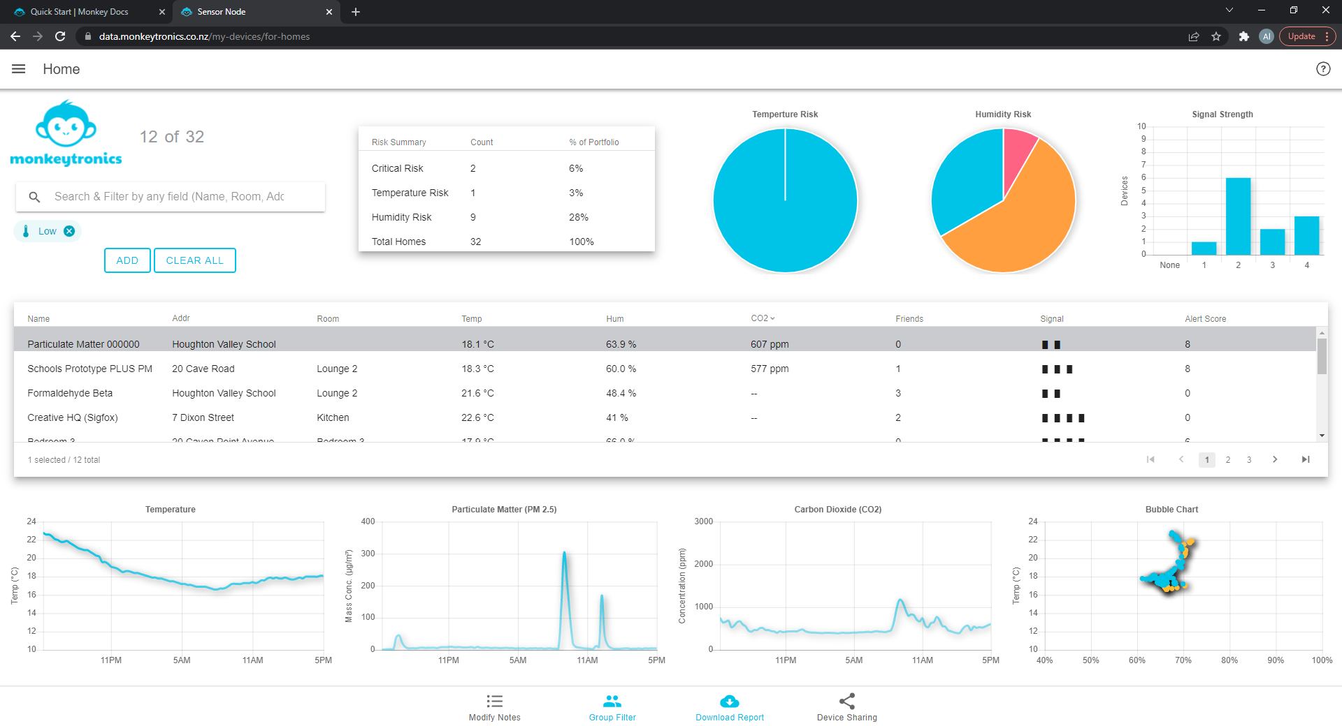
Figure : Filter : Temperature Risk = Low
On the other hand, if we only wanted to see devices at a specific address at high humidity risk, we could type the address in and click the red segment in the humidity pie chart.
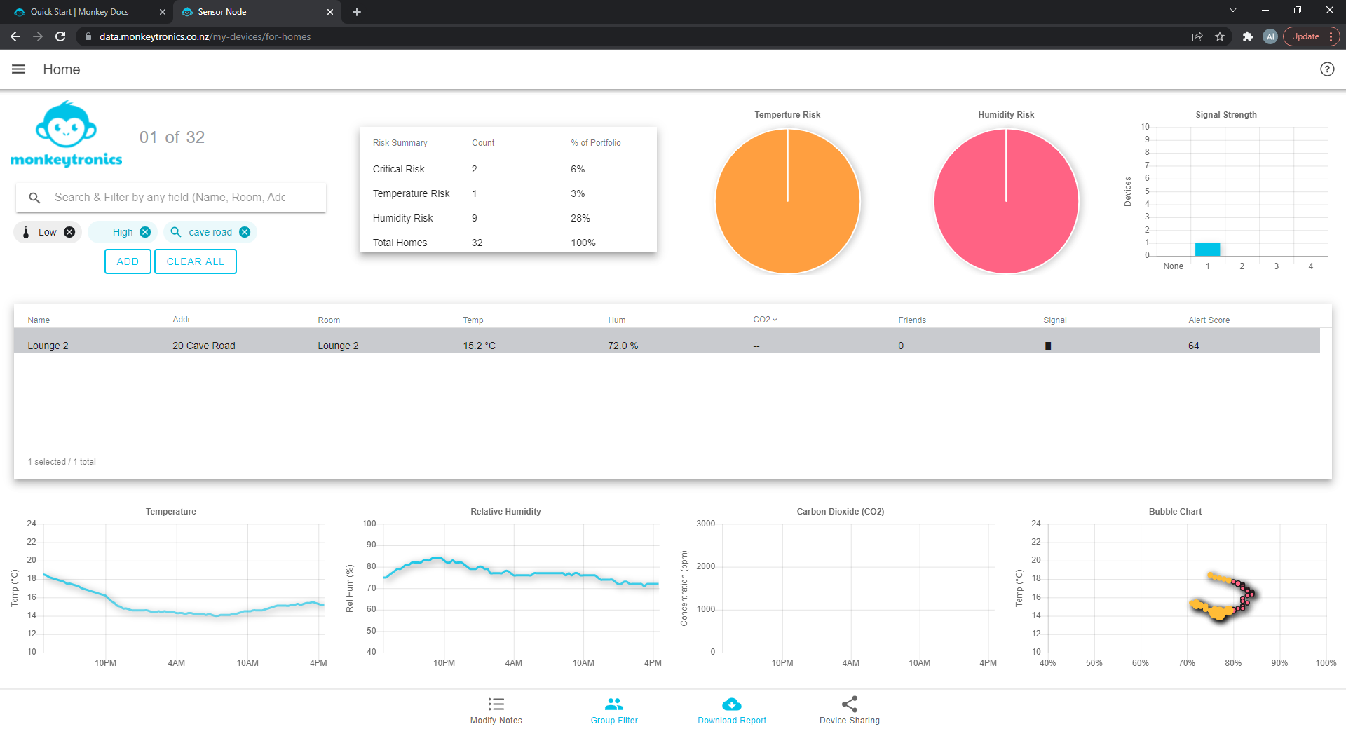
Figure : Filter : Humidity Risk = High && Address Matching
Or we could do add any combination of these filters. The text filter is applied to the name, notes, classroom, school, device Id and groups fields.
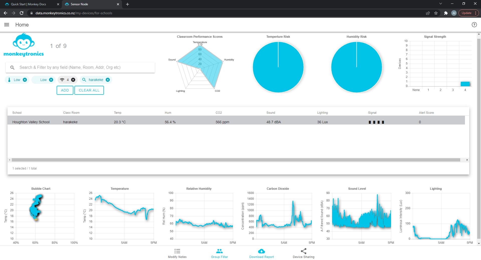
Figure : Filter : Combined filter
Device Data
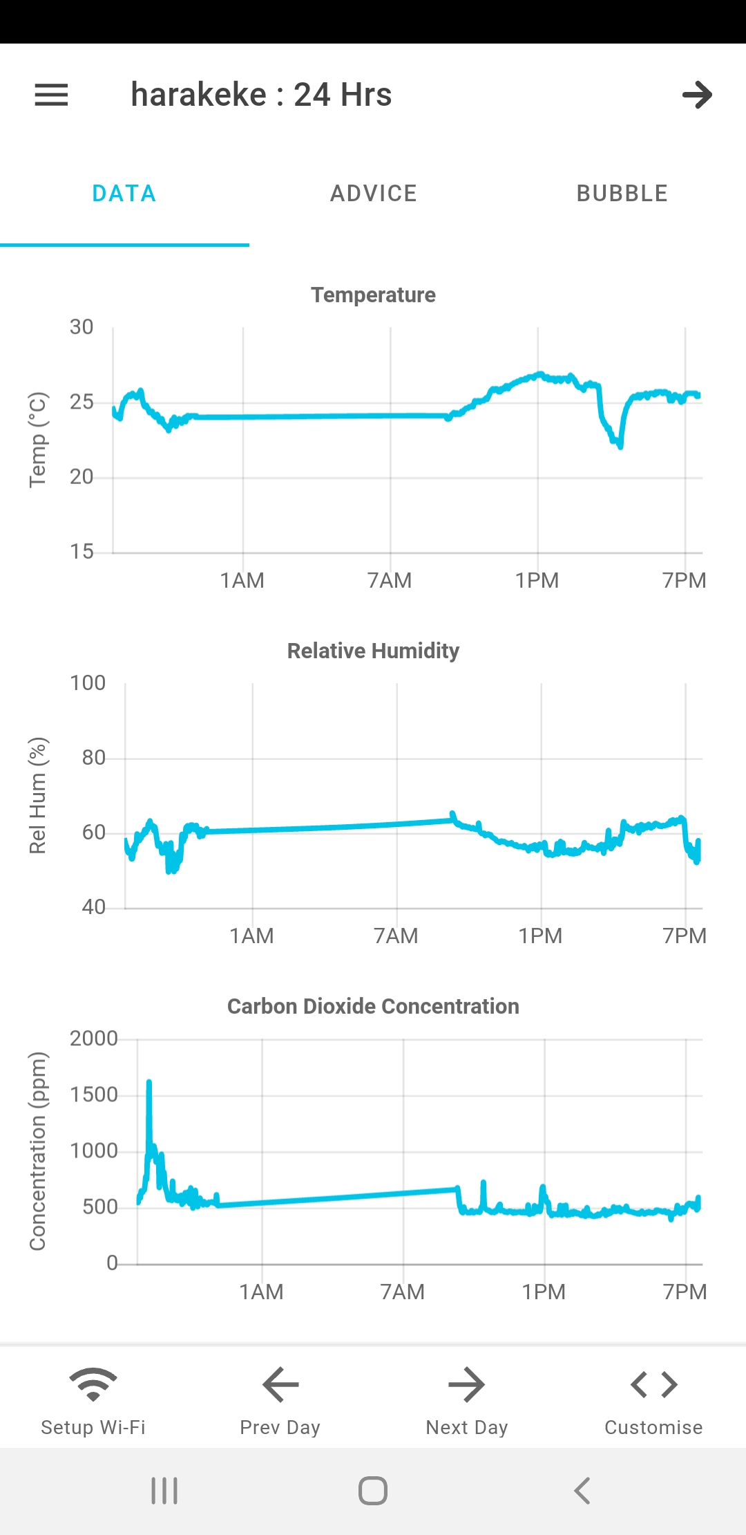
Although there are slight differences in the presentation of data between the mobile app and the web portal, let's focus on the mobile app as it's more compact to illustrate. To reach the device page, click on that device in the home page. From the web portal you need to click on one of the device graphs or double click the device in the table.
The following information is shown in the device data page:
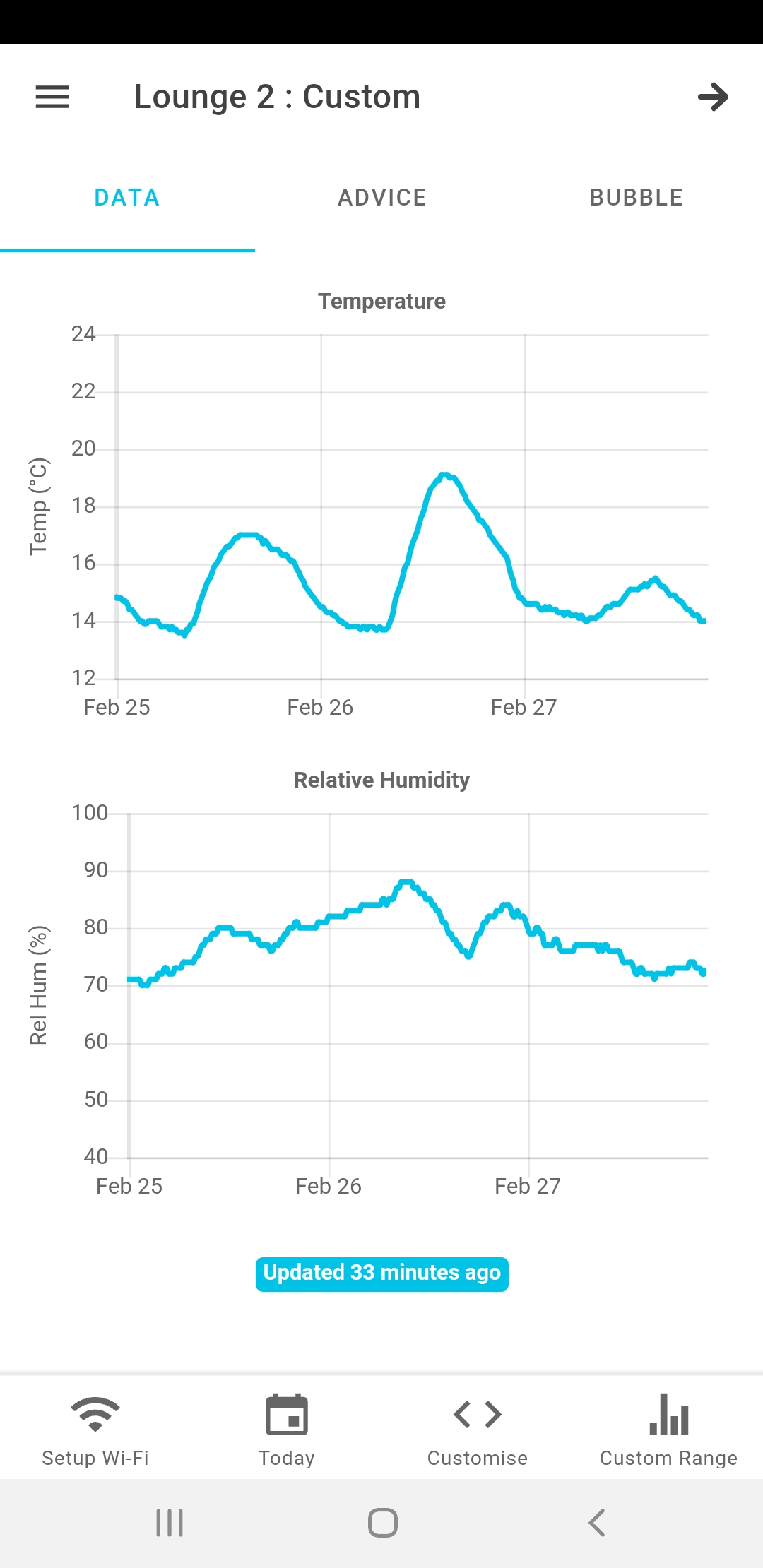
- Time series data, in which the readings are plotted on a time axis. This is a simple, intuitive way to observe data over time.
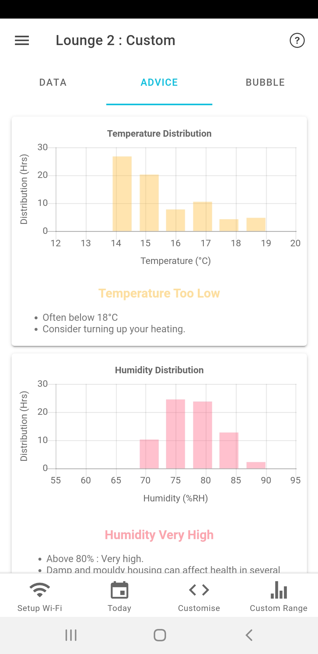
- Advice page. The raw data is plotted as a histogram to highlight which values are more common. This allows us to measure how often the readings are outside the comfort zone. It's the most useful visualisation in terms of behaviour.
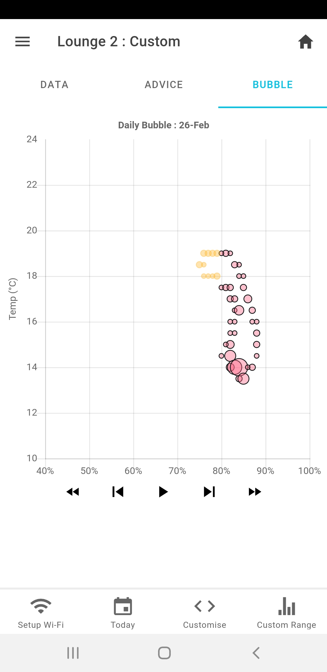
- Bubble data. We use a bubble chart to visualise the interaction between temperature and humidity. This offers insights into how the conditions in the teaching space are changing throughout the day.

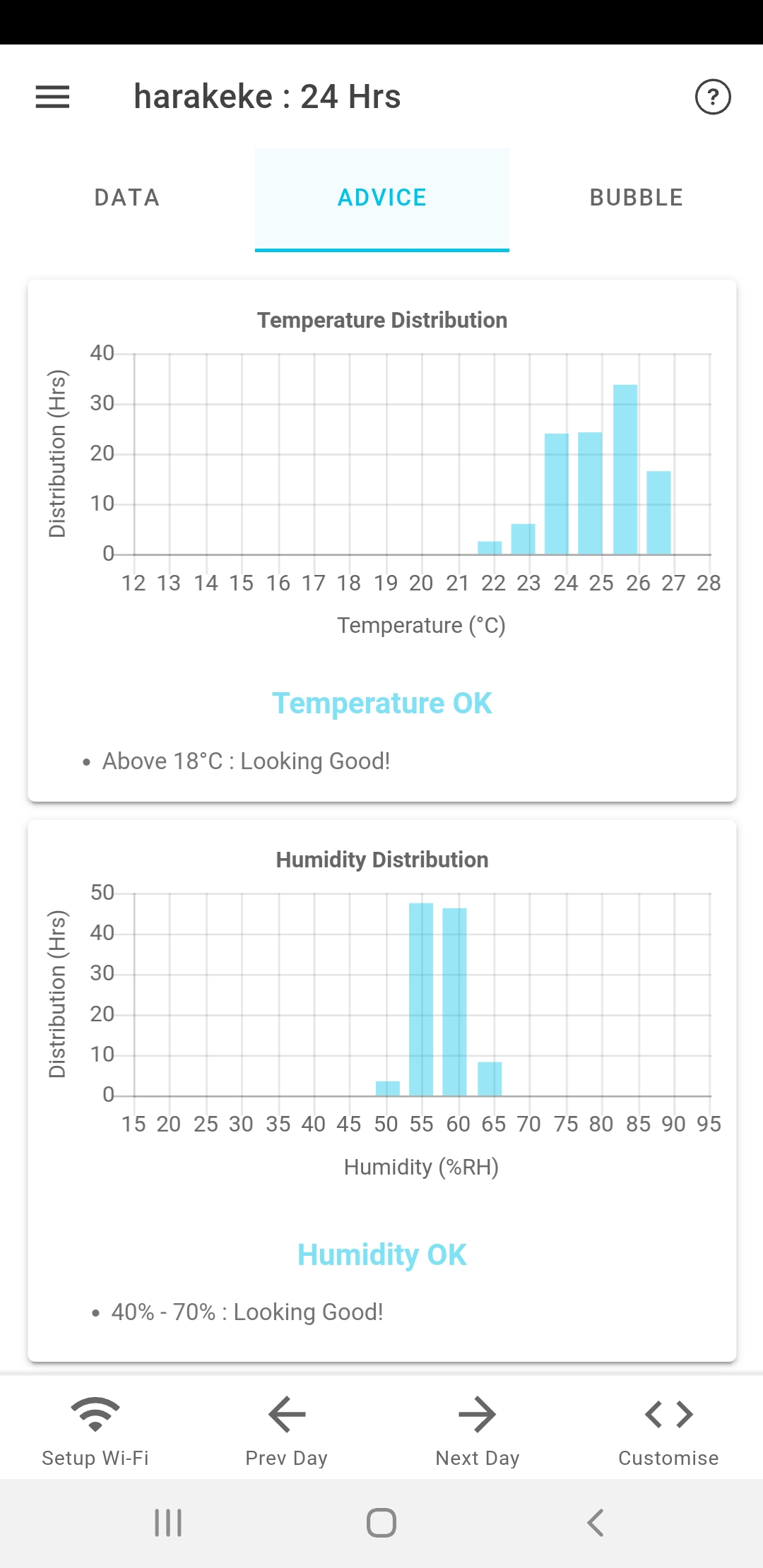
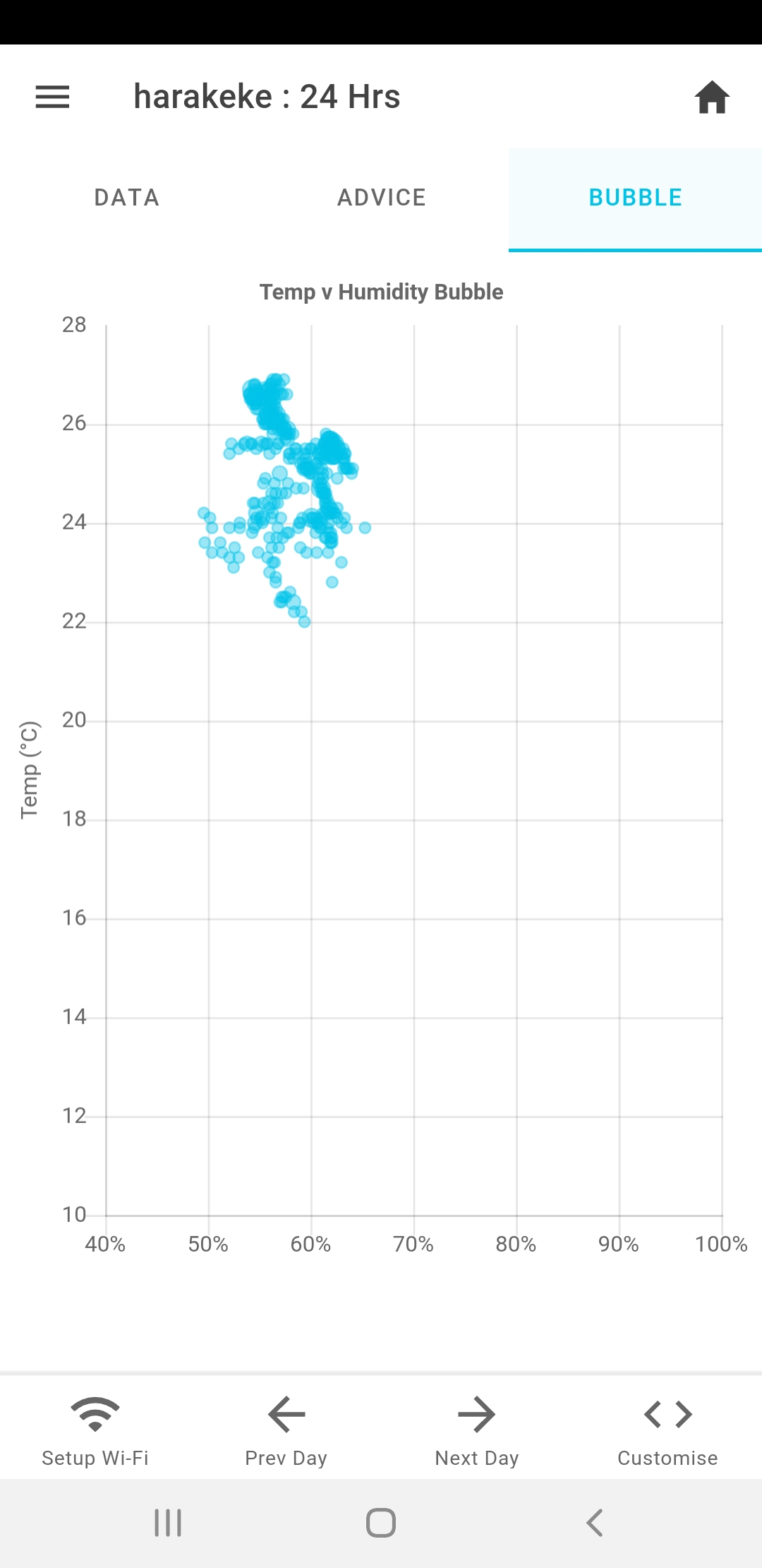
In an ideal scenario, the bubble chart should show a tight grouping of points all above the minimum recommended temeprature. In classrooms with less ideal conditions, the bubble chart will display as a large circle passing into the orange and red zones. This chage is driven by changes in heating and outdoor temperatures. The follwoing graphs illustrate what poor performance looks like, during a cold and wet spell:
Project Settings
PRO TIP
Project Settings are only available if you have set Organisation = Yes in your Account Settings.
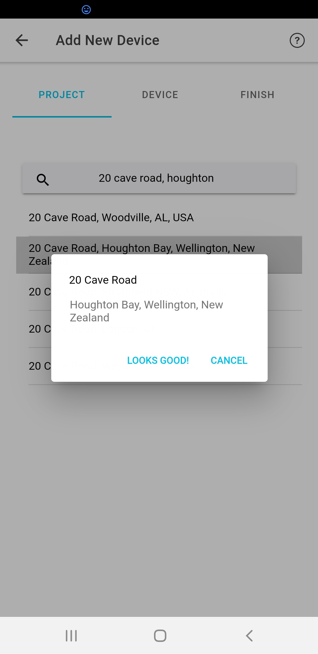
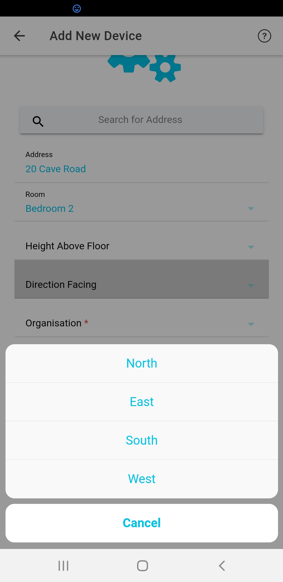
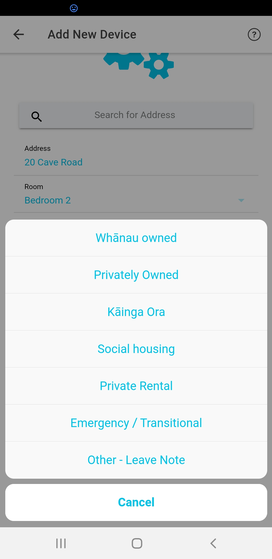
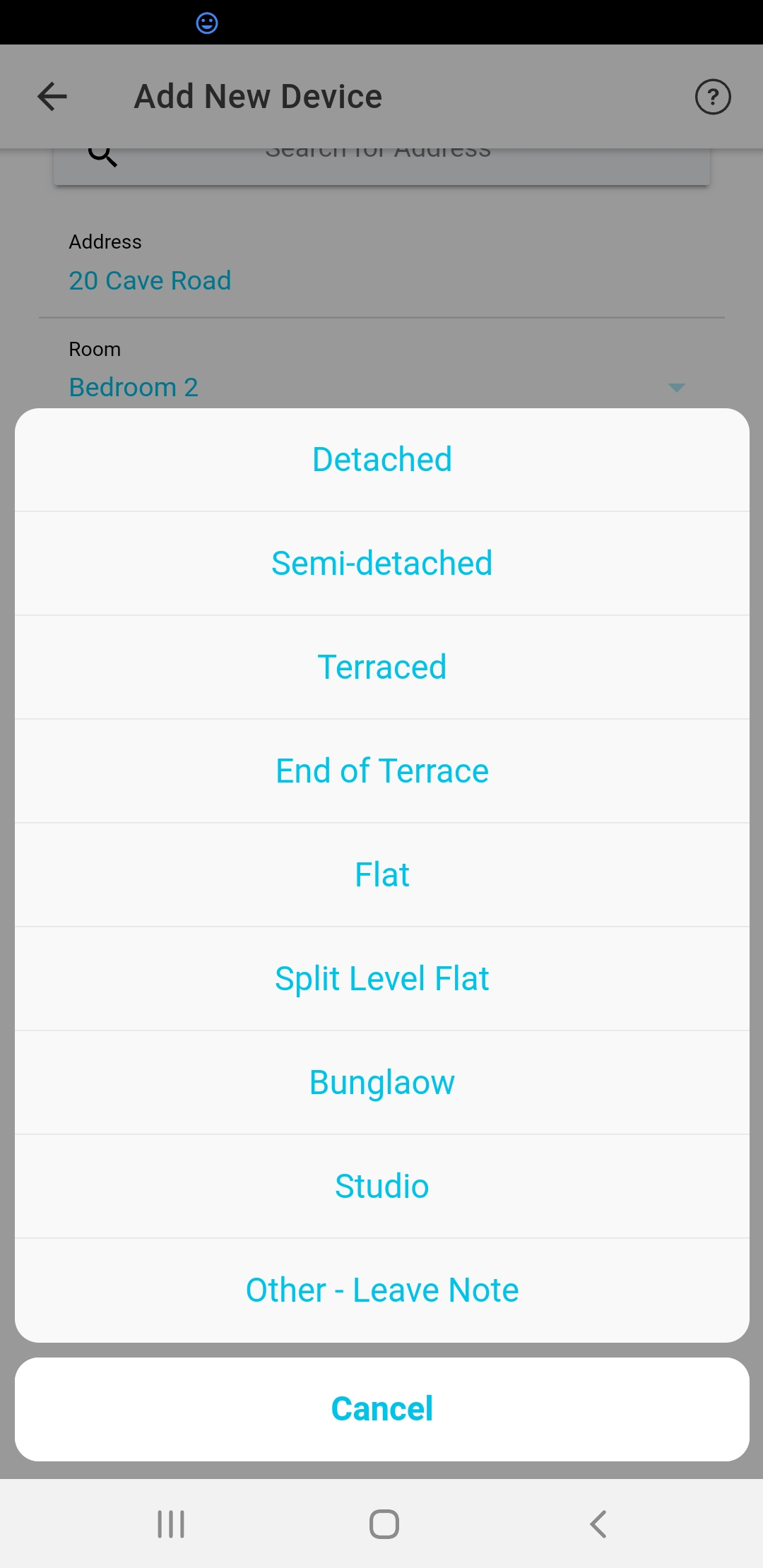
Sensor Node was designed for scientists, researchers and project managers to carry out complex data analytics. In order to do that, we have added project settings in as a way to allow you to integrate a rich set of device property fields into your data set in a way that makes sense and can be used downstream to super charge data anlysis.
For instance, by linking each device to the city in which it is deployed, in the analytics engine, we associate outdoor weather data with the device and look at the indoor versus outdoor temperature and humidity correlation. We can also examine the difference between schools, buildings or floors of a building. Basically, the more information you put in, the more insights we can push out. Here are some of the things which can be done:
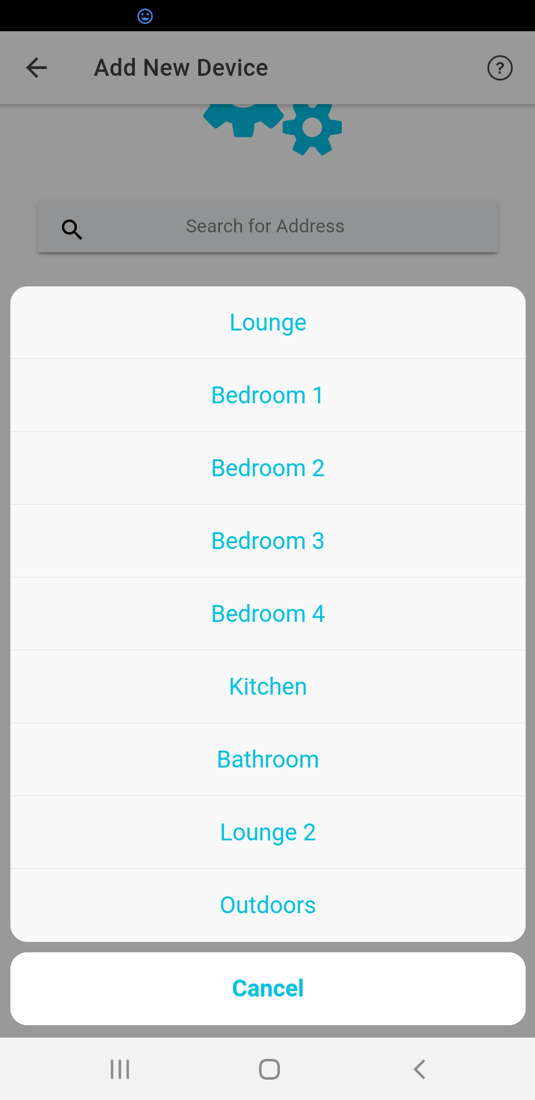
Add/Scan New Device
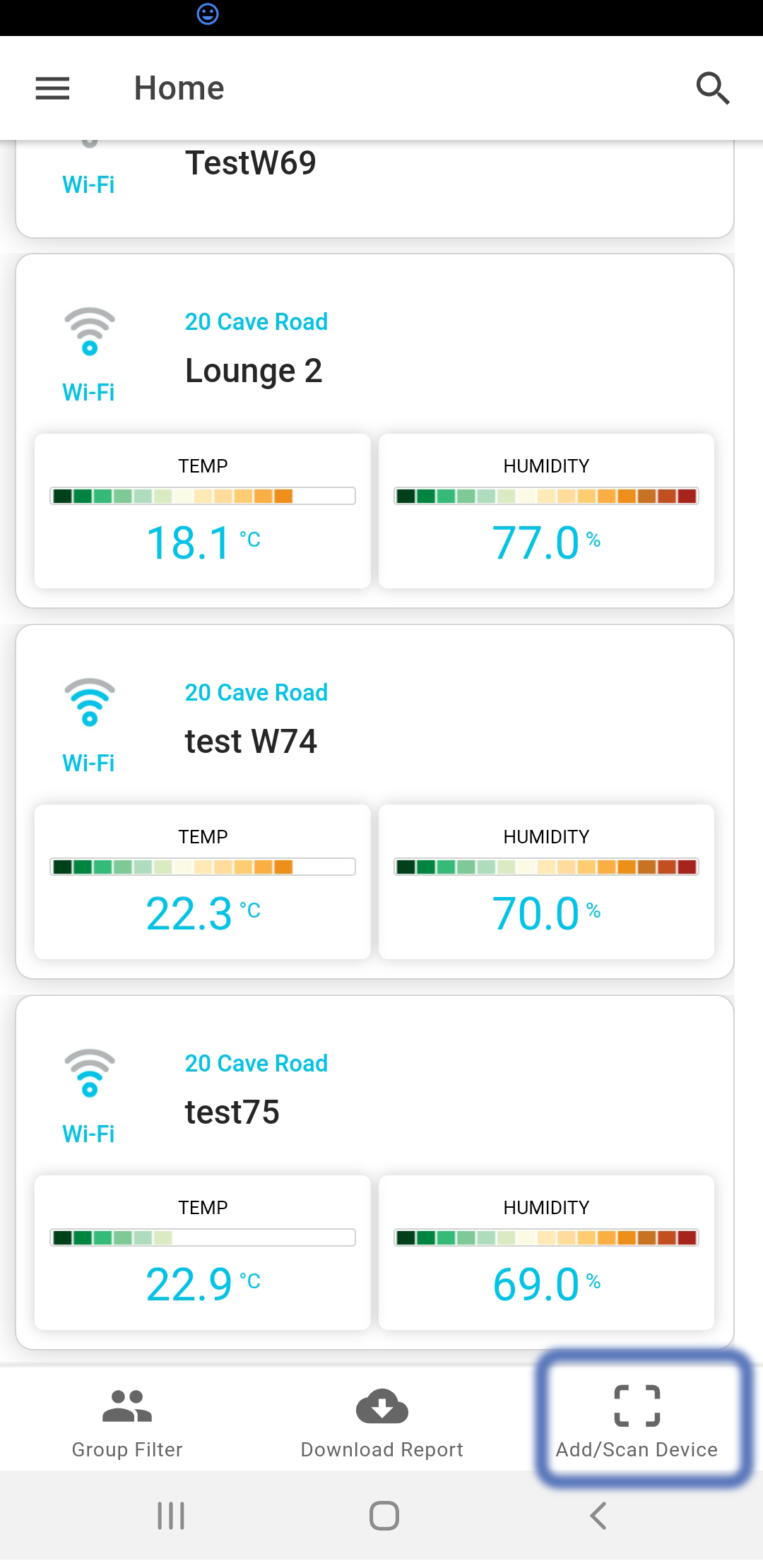
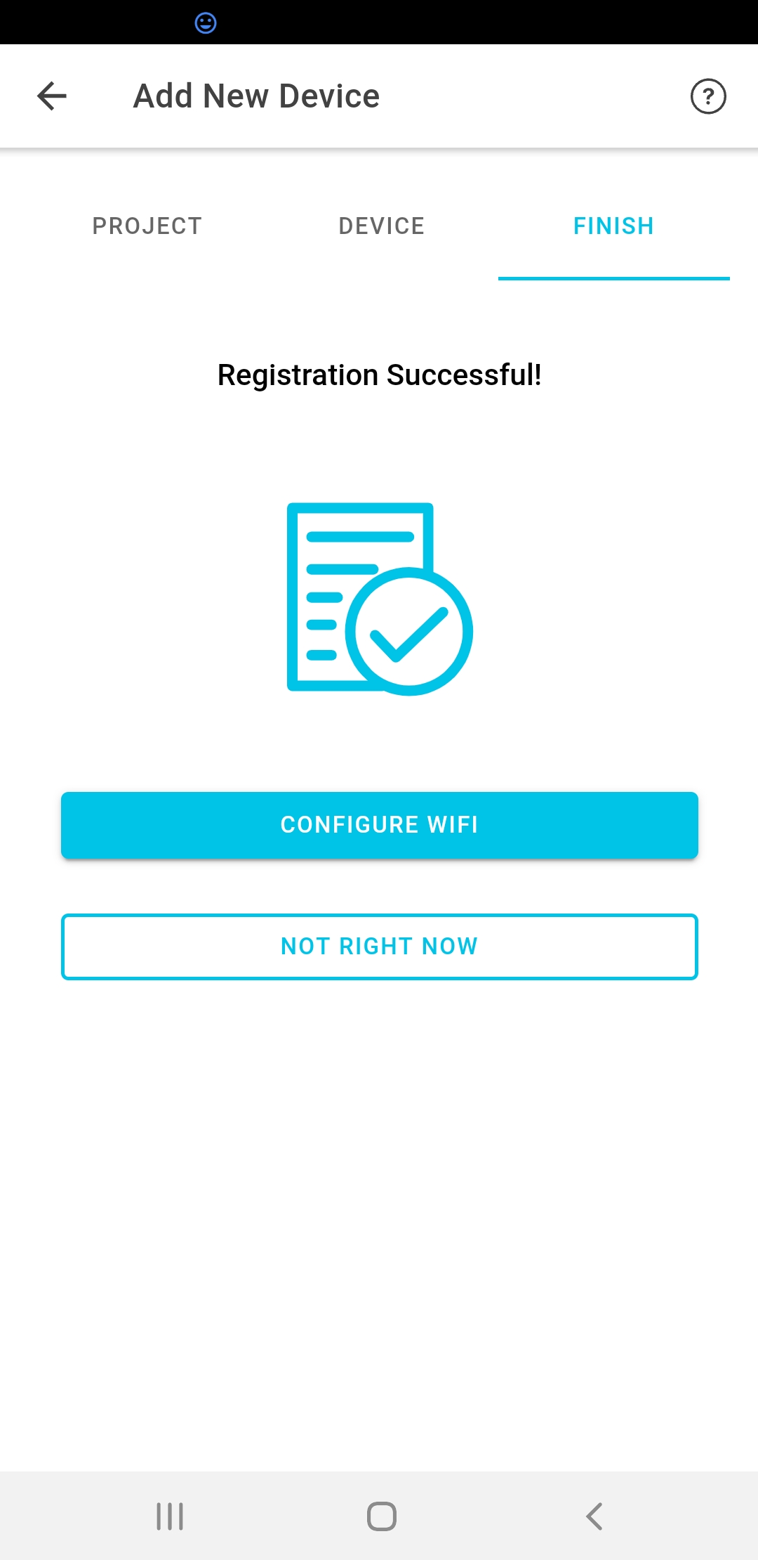
Once you've signed into your account, you can register your first sensor node device. First click on "Add/Scan Device" from the Home page in the mobile app. A QR code scanner will appear. There will be a QR code on the sensor node device, and on the box it came in. This contains unique credentials are used to register the device to your accout. Once you have scanned the QR code, follow the remaining steps in the add new device wizard. If everything goes well, at the last step, the sensor node mobile app will ask if you want to connect to Wi-Fi next.

Set Up WiFi
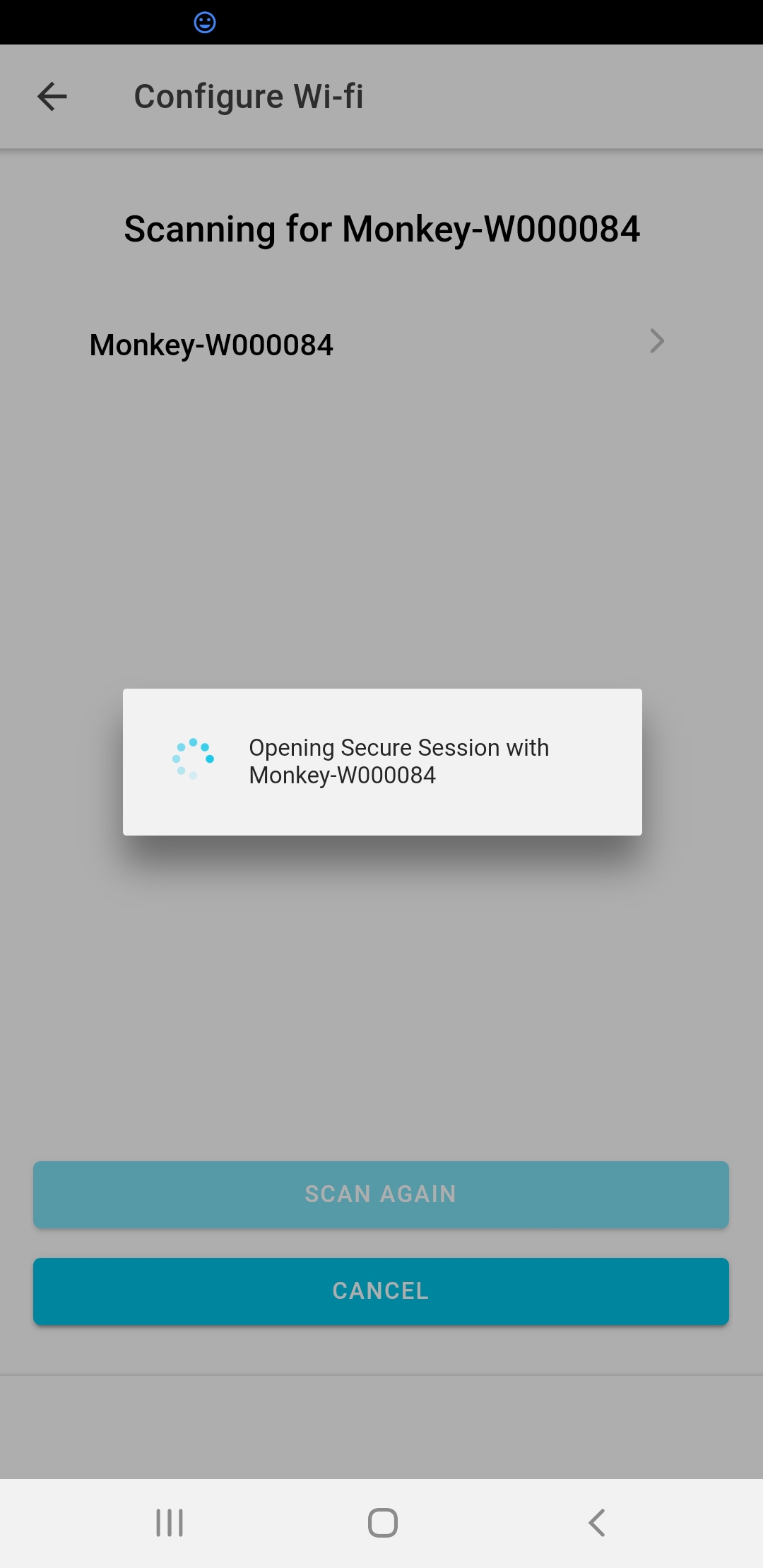
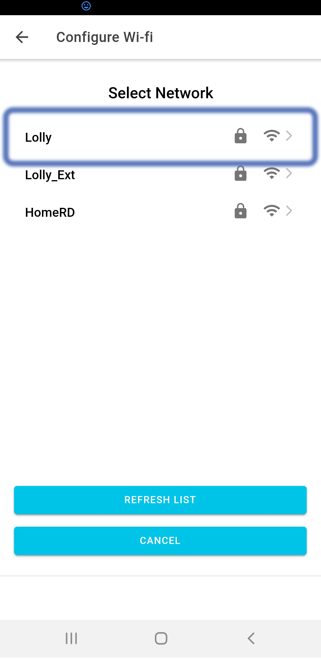
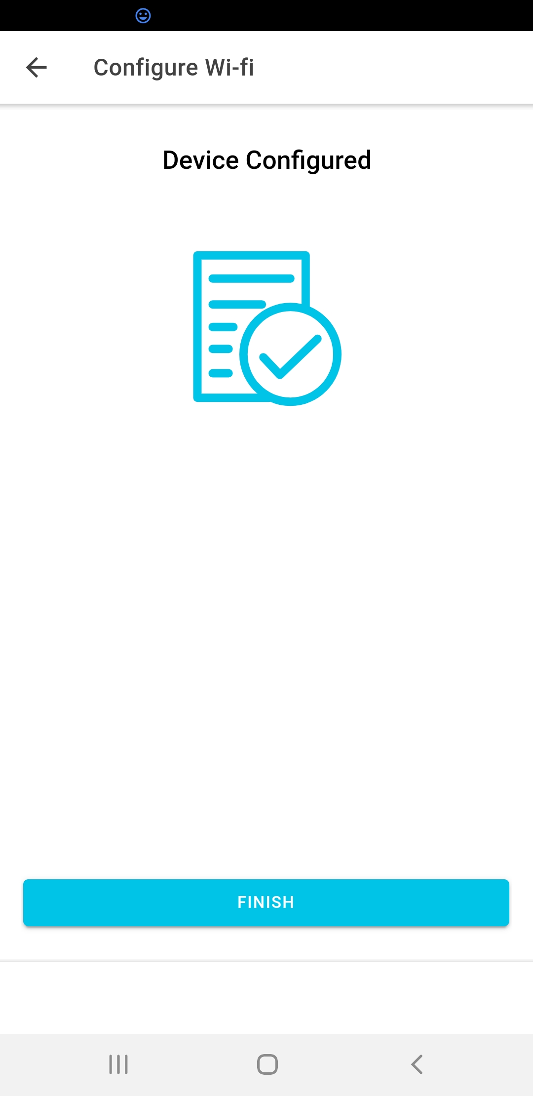
After you have successfully registered your device, you can proceed to "configure WiFi" credentials securely over an encrypted Bluetooth link. Before you proceed, push and hold down the mode button on the back of the sensor node device. After about 3 seconds, the device will restart. Once you see the Bluetooth Symbol appear, the device is ready to connect. Back in the mobile app, click "Configure Wi-Fi". If you experience any problems during this phase, just press (and hold for 3 seconds) the sensor node mode button again to set up a fresh Bluetooth session and try again.
PRO TIP
If this process succeeds, you will see the "Success" page in the app. However, occassionally the communications between the device and yuor phone can complete early. For prodcuts with an LCD screen, check if the little WiFi icon is present on the device screen to confirm that the process has worked.
Share Access to Your Devices
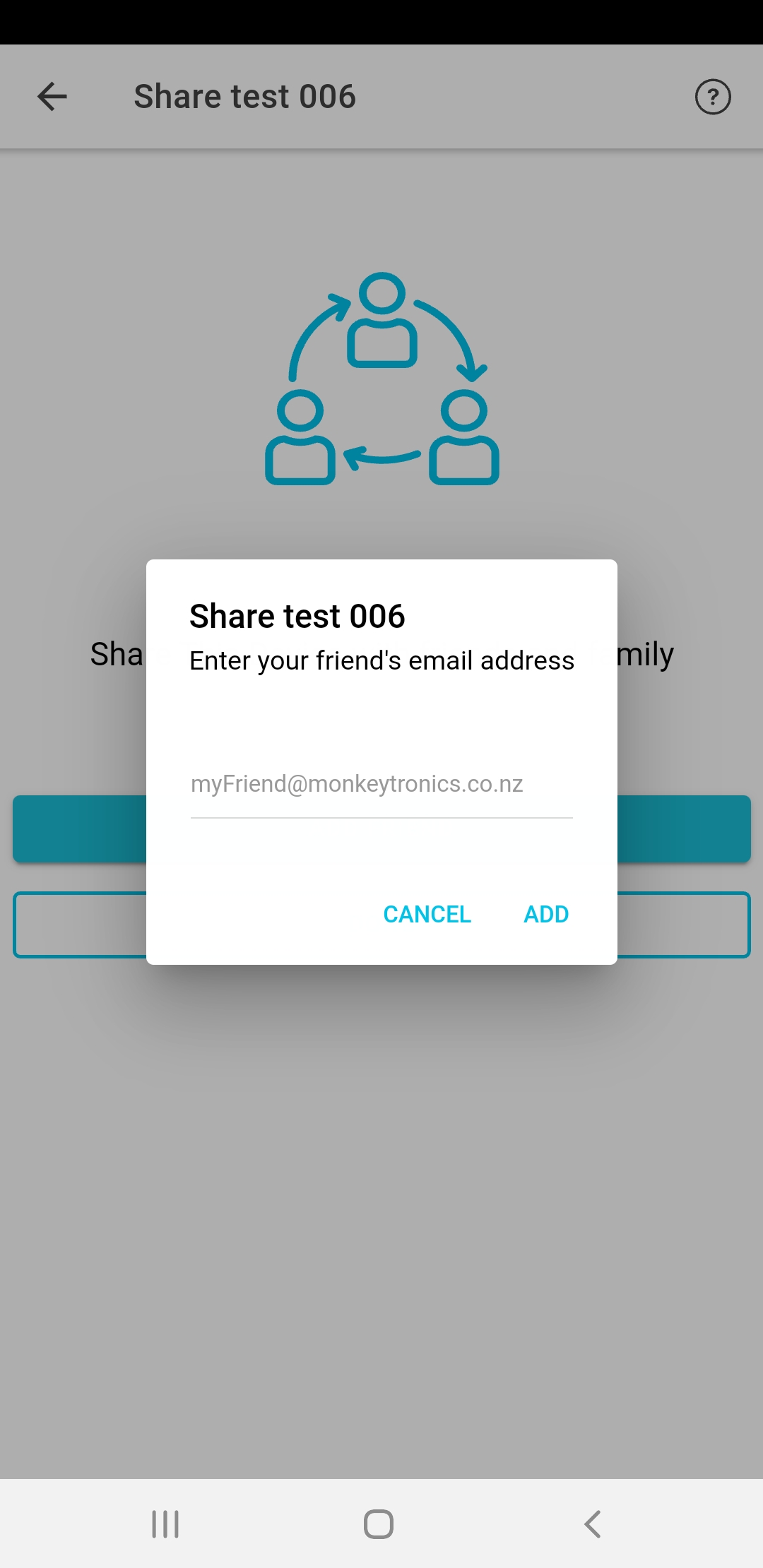
You can share your data with students and teachers by giving them shared access to your devices.
- Get your friend to set up a Monkeytronics user account by downloading the app and registering. That's all they have to do.
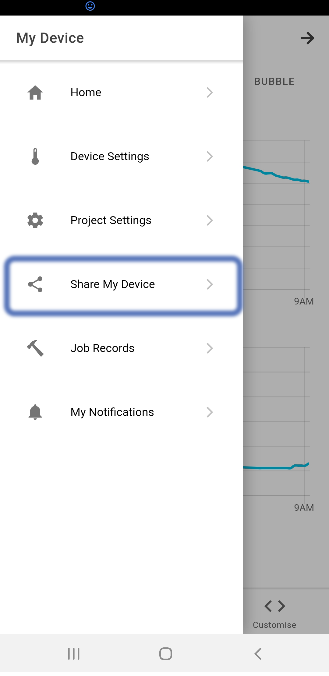
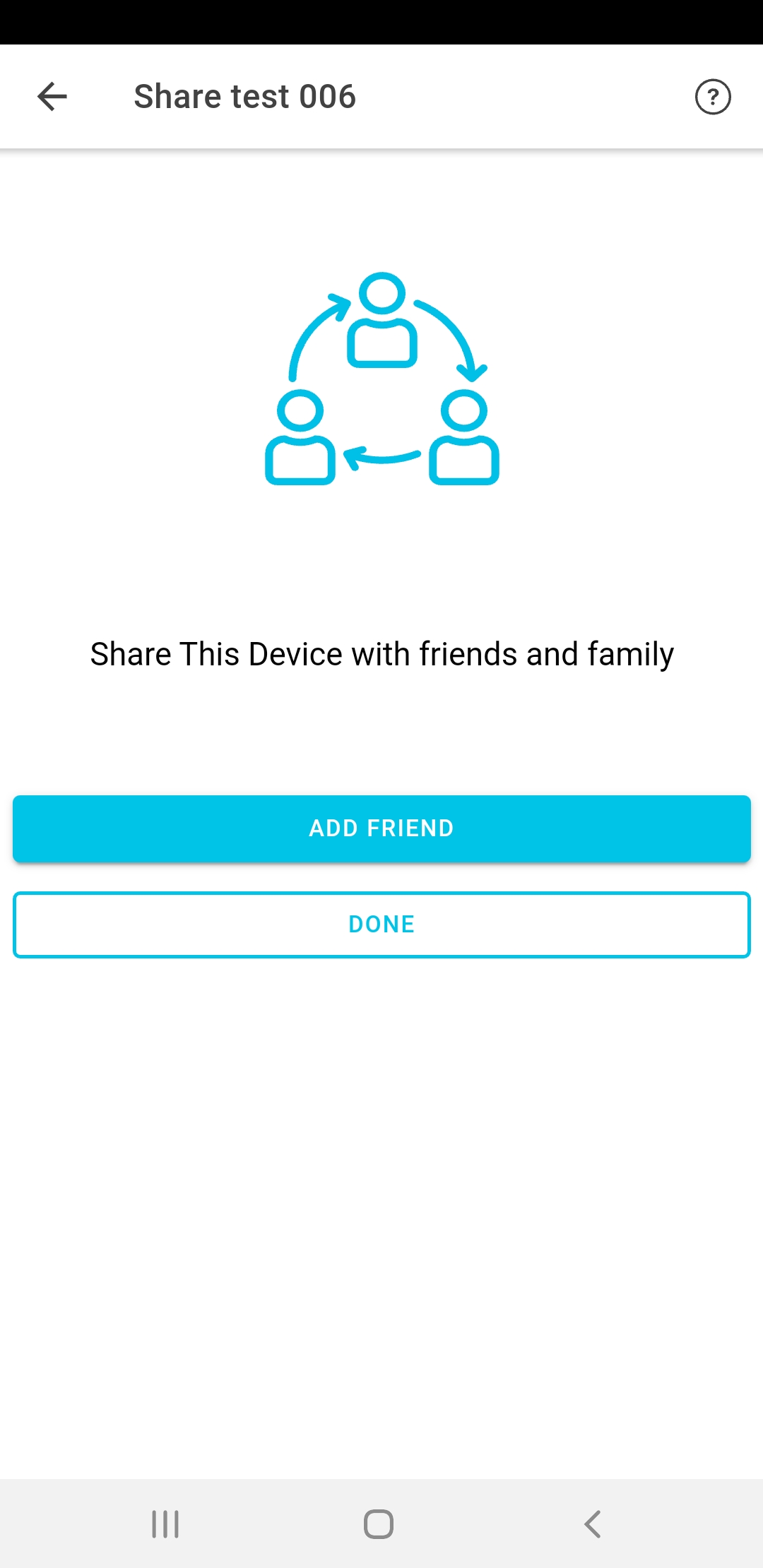
- In your account, tap the device you want to share. Then from the ≡ menu select "Share My device".
- Type or copy & paste your friend's email address. You're all done!
PRO TIP
Only the device owner can share a device. So when someone shares a device with you, you won't be able to share it on to someone else.
PRO TIP
When you share a device with someone, you can remove access any time you like.
Group Your Devices
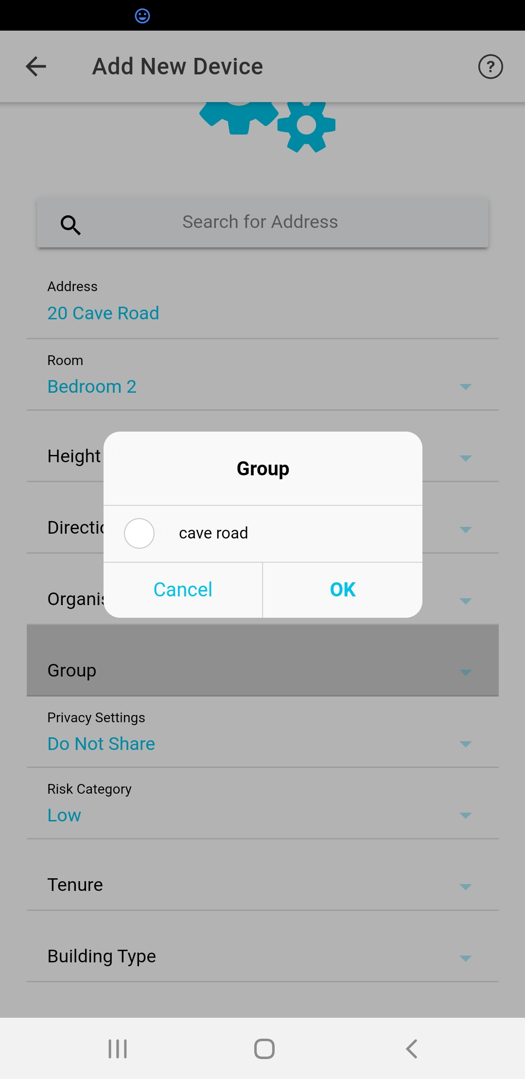
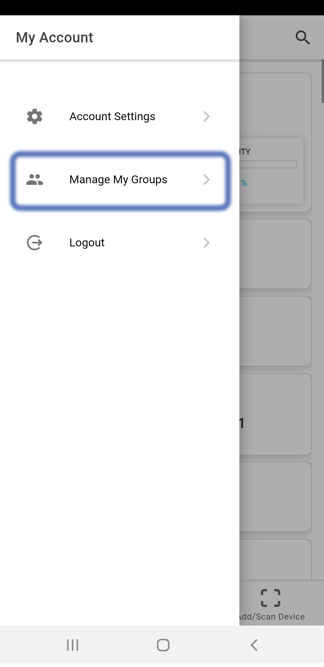
One feature which we have meantioned but not described properly is groups. Every user can set up a predefined set of groups for their devices. This can be anything you want. Let's say you have a project and you want a way of identifying the devices that are part of that project. Starting from the home page, open the ≡ menu and go to 'Manage My Groups'.
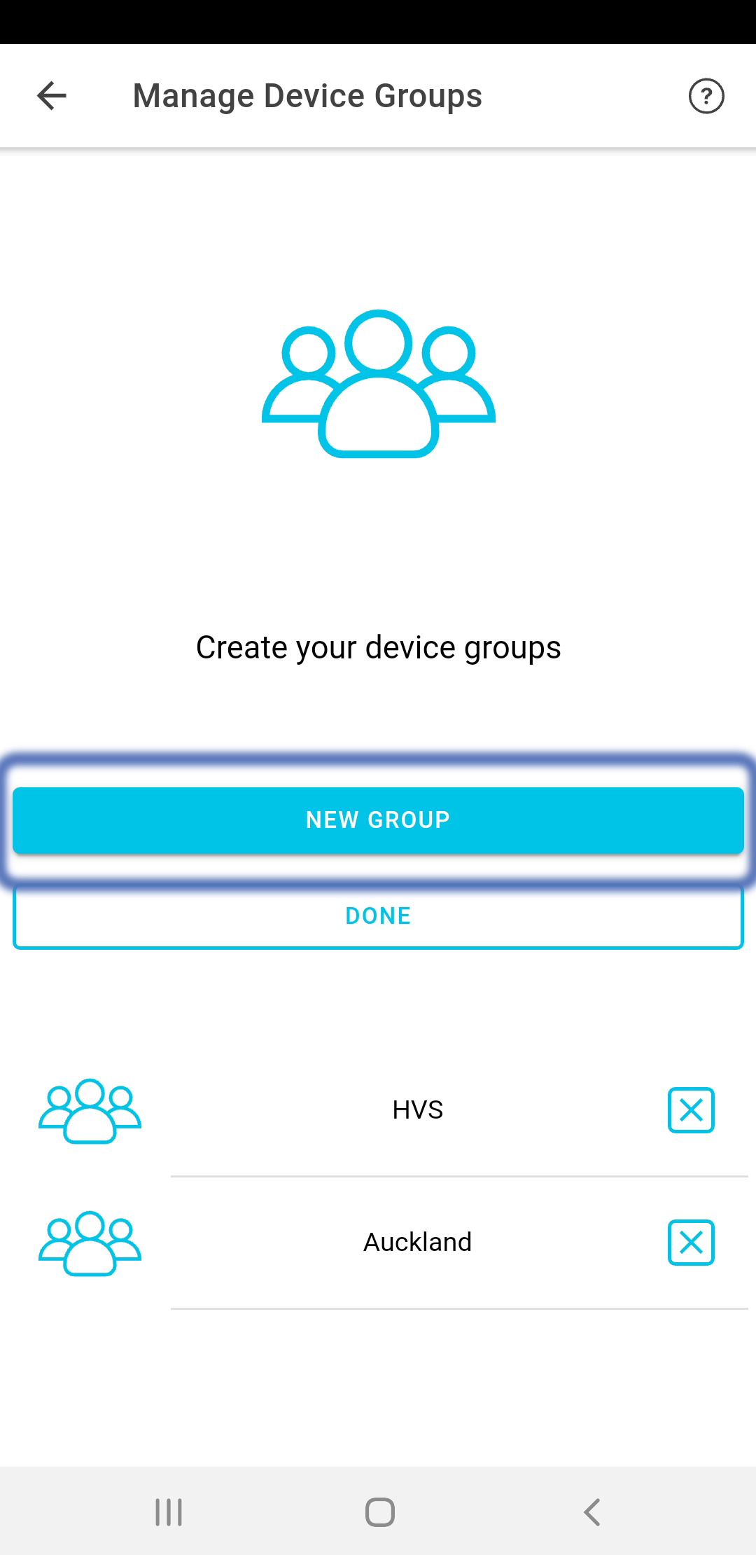
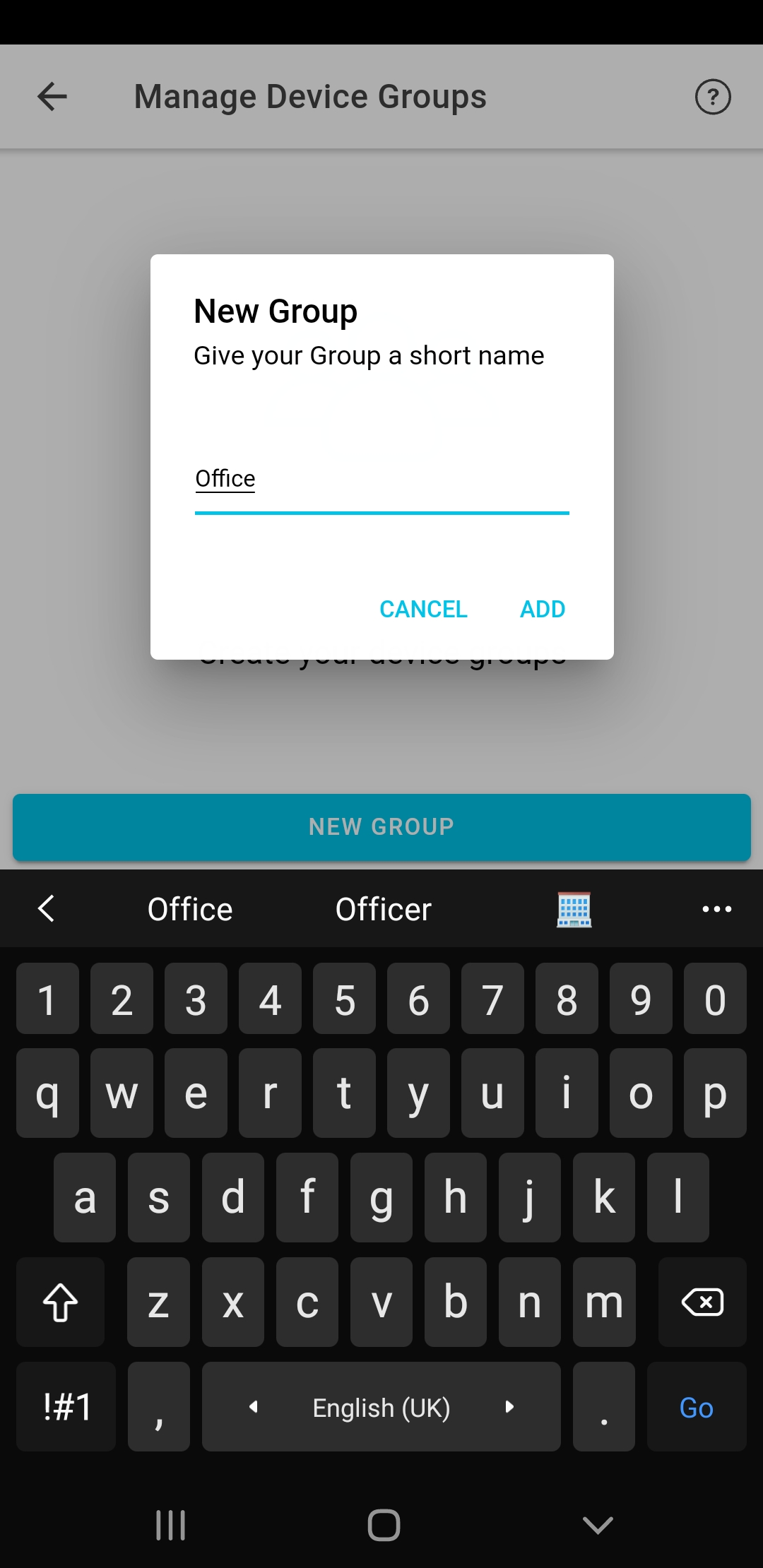
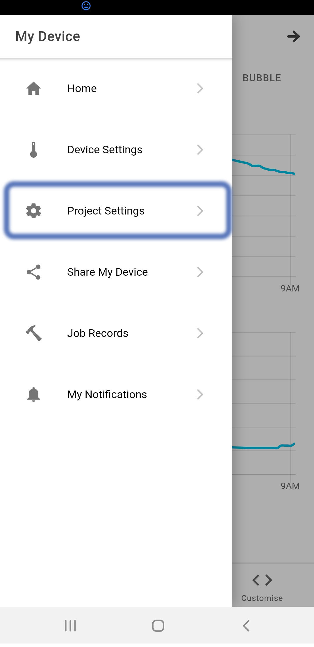
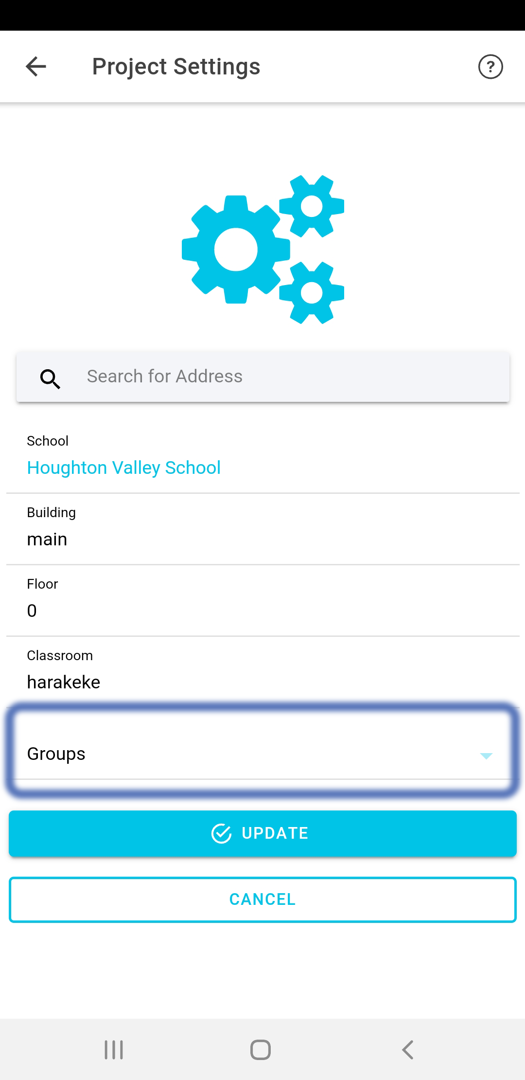
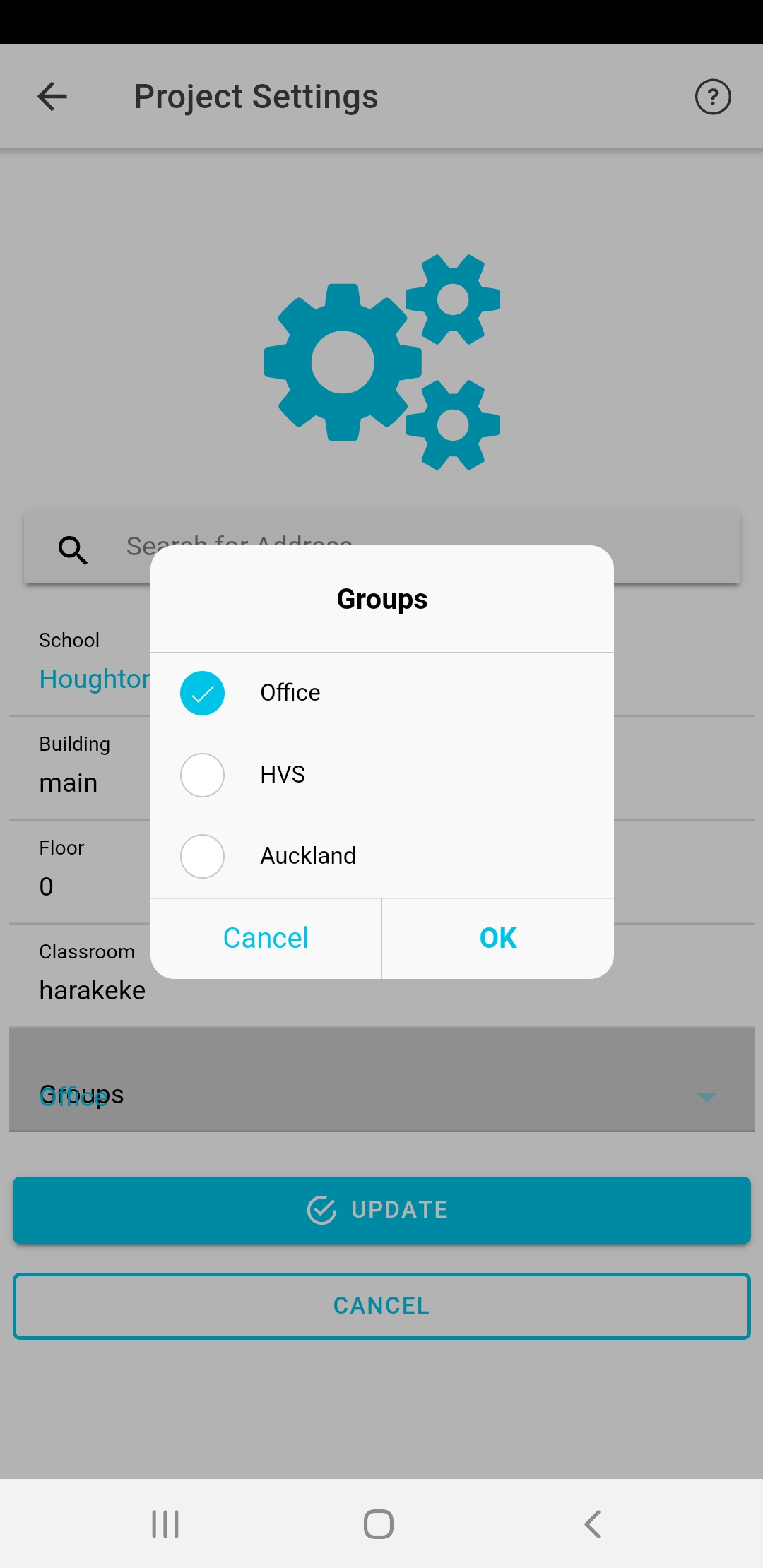
Now having created this new group, you can link it to your devices. This is actually integrated into the add new device page. But you can also do it afterwards. Go to the device page, open the ≡ menu and go to 'Project Settings'. You should see your new group available in the group drop-down.
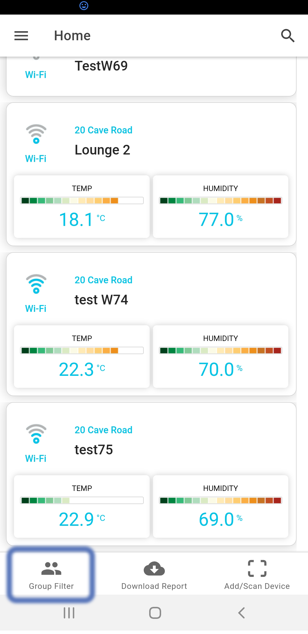
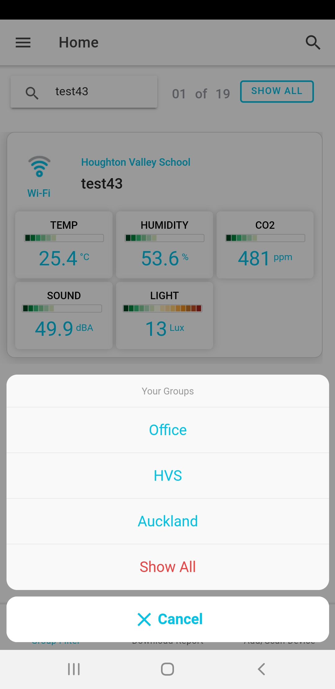
There is one more thing to note regarding groups. From the home page, you can click the Group Filter tab. This will open a pop-over menu with all of your groups on it. This is basically a short cut to typing the Group text into the search bar. This is especially handy if you want to regularly search for the same group of devices without worrying about typos.
Generate Reports
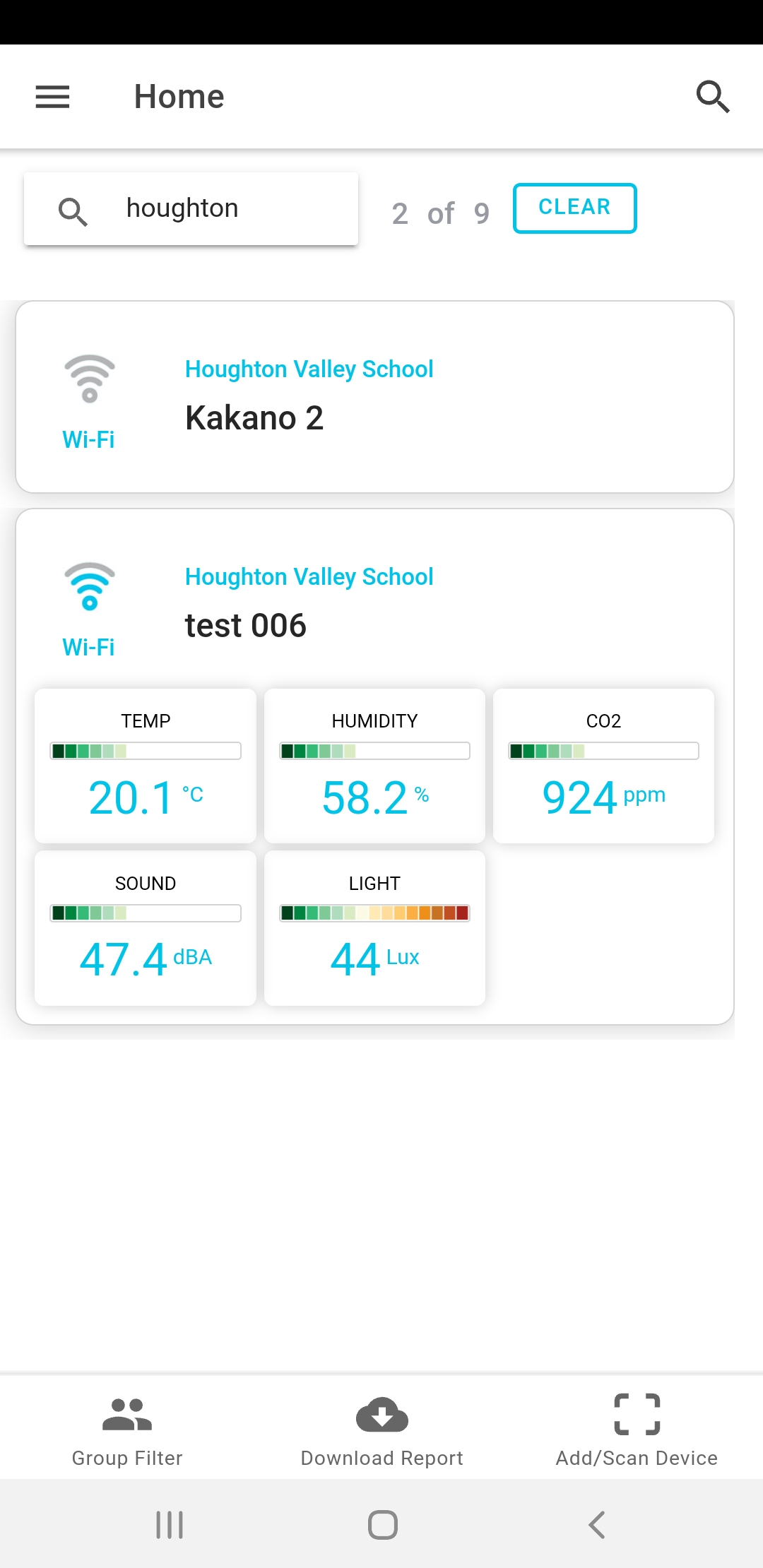
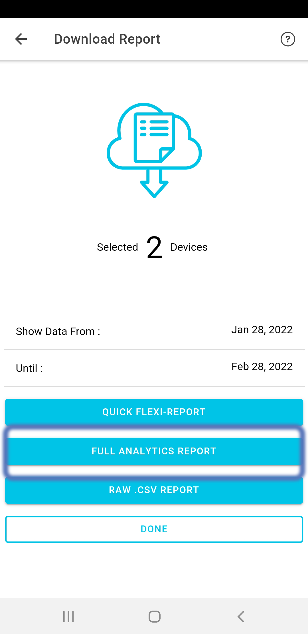
Reports are generated within the app, starting from the home page. The first step is to use the filtering or search function to select the devices of interest. It may be better to work in the web portal so you can take advantage of the more precise filtering. If you use this function regularly, you should set up device groups to make things easier.
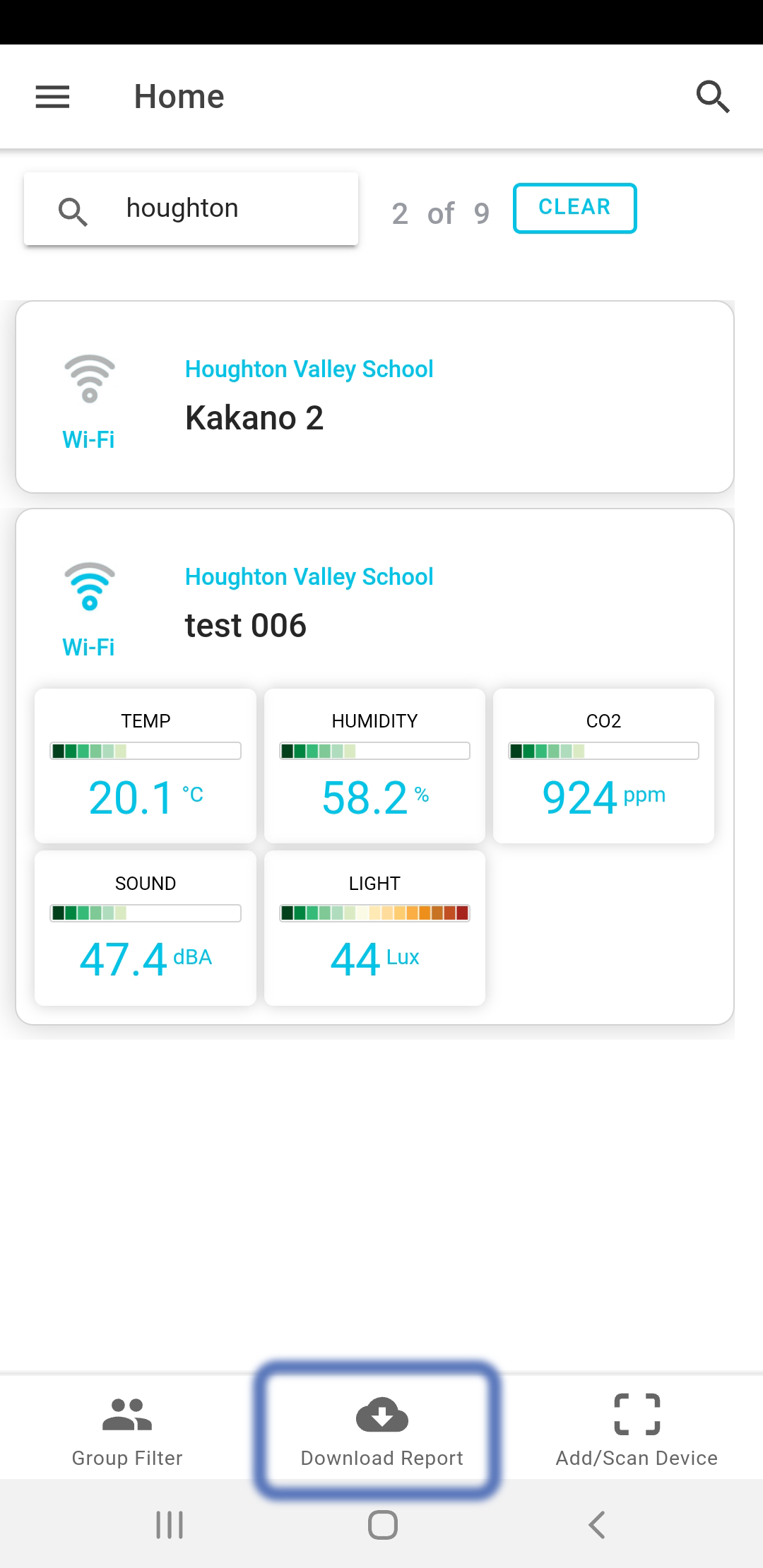
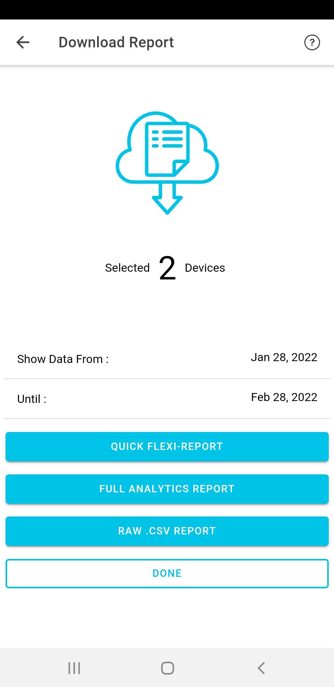
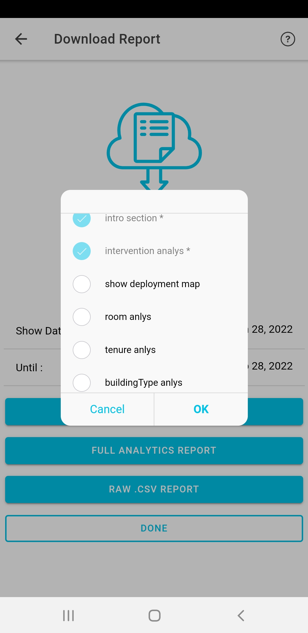
If you have set organisation = YES in your Account Settings, there will be 3 reporting options present. Otherwise, only the Quick Flexi Report is Available. When you select the full analytics report, you will be prompted to customise the elements to report on. There are a number of standardised options:
- Show Deployment Map
- Room Analysis
- Tenure Analysis
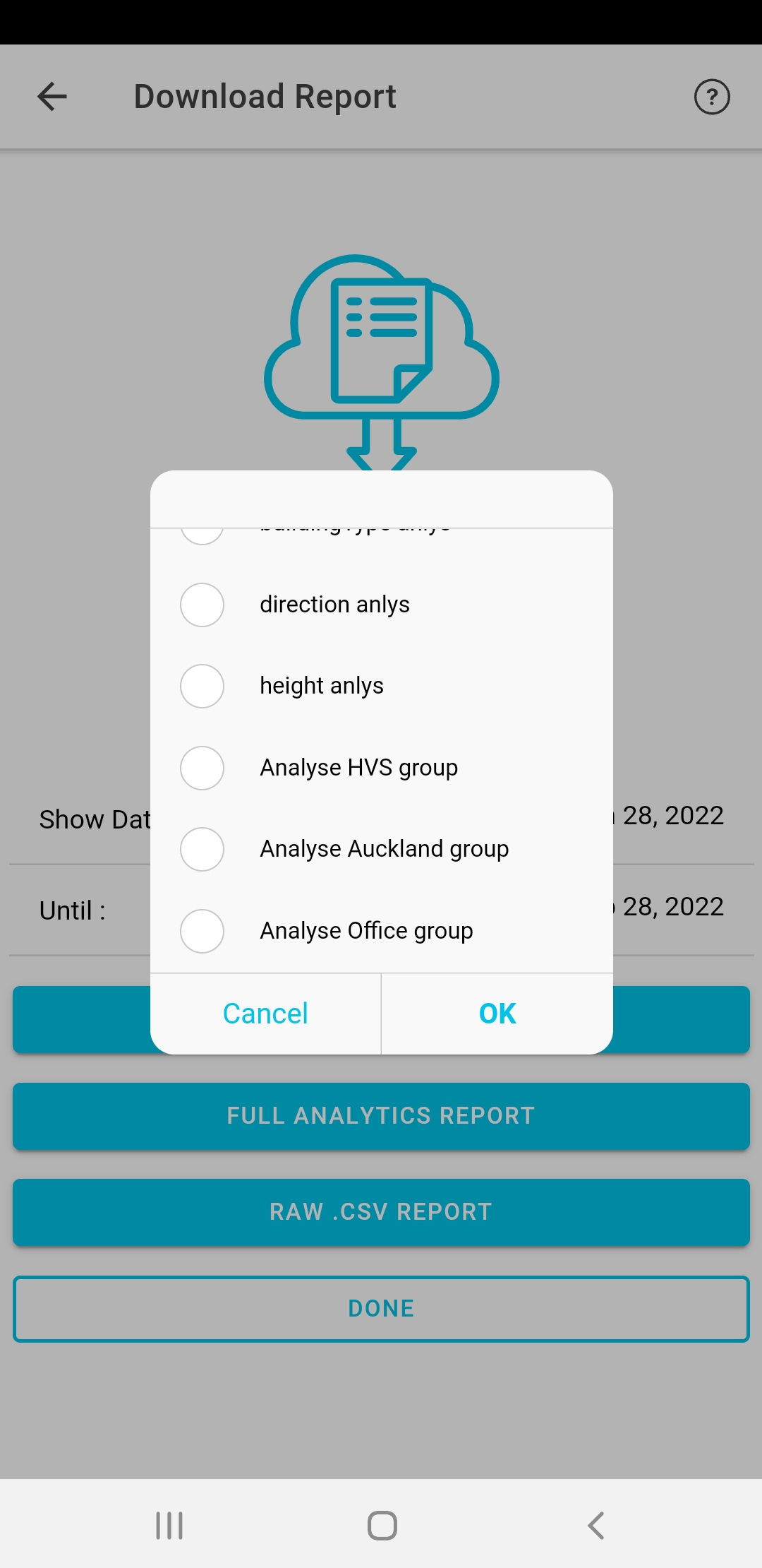
- Building Type Analysis
- Height Analysis
In addition to these, you will have the option to perform an analysis based on any one of your Groups - the ones you have created yourself. In our example case, that means we can also examine:
- The HVS Group
- The Auckland Group
- The Office Group
Reporting Outputs
When you submit a report, it is queued in the cloud where a dedicated Analytics Server is spun up dynamically to meet the demand. It may take a short time to complete depending on resource availability and the complexity and size of your report. When the analysis is complete, it will email the report to you in html format.
If you select the "Show Deployment Map" option, your report will include a map similar to the following map of an Auckland deployent.
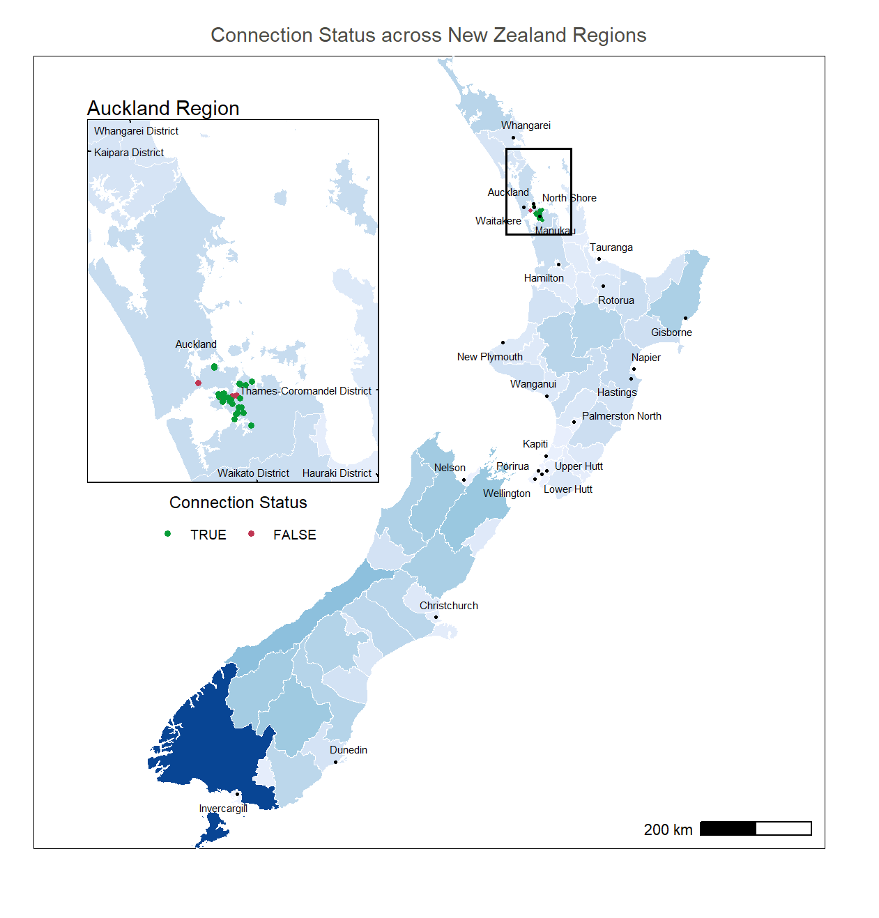
Figure a : Deployment Map
For each Analytics Option selected a number of outputs are produced. Firstly, the temperature risk is analysed. This metric was designed in collaboration with He Kainga Oranga and considers the night-time personal exposure for occupants of the space.
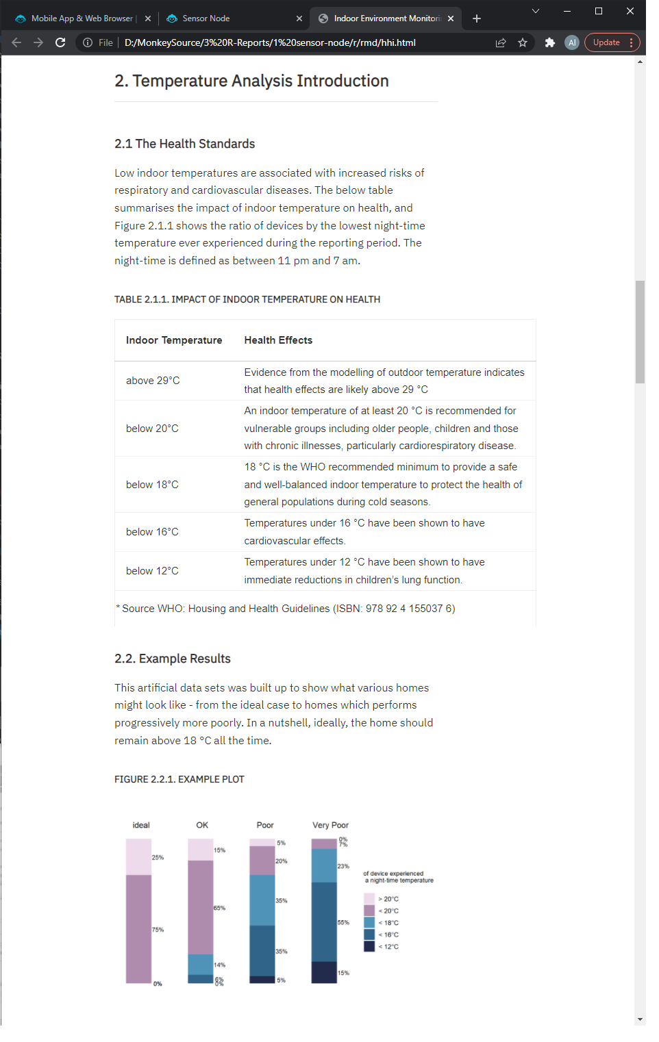
Figure a : Night Time Temperature Risk Analaysis
We also produce an indoor-outdoor correlation analysis. This measures the performance of the building envelope - how well it insulated the occupants from the elements.
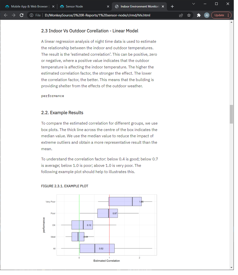
Figure a : Indoor - Outdoor Correlation Analaysis
Device and Project Settings
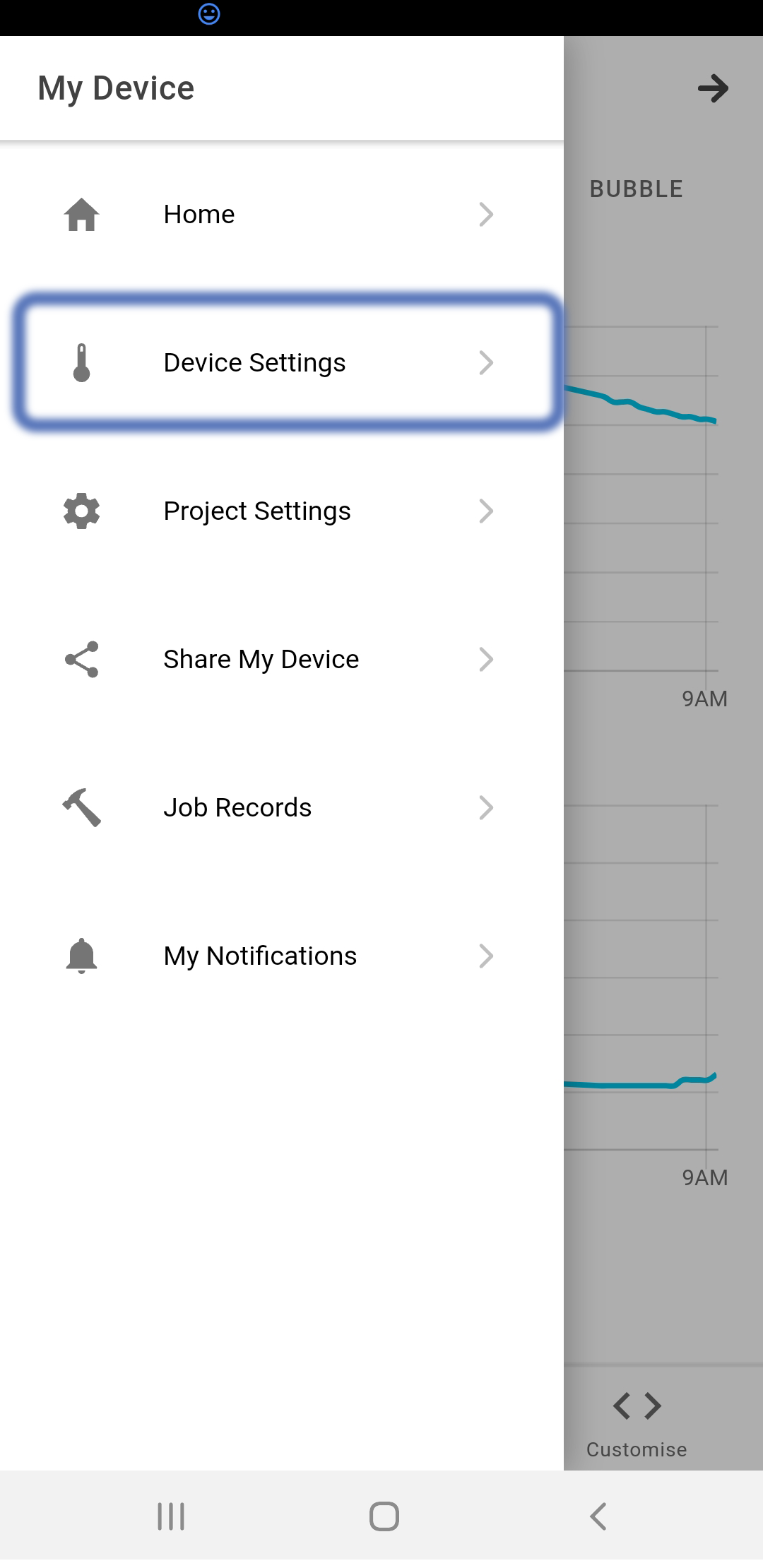
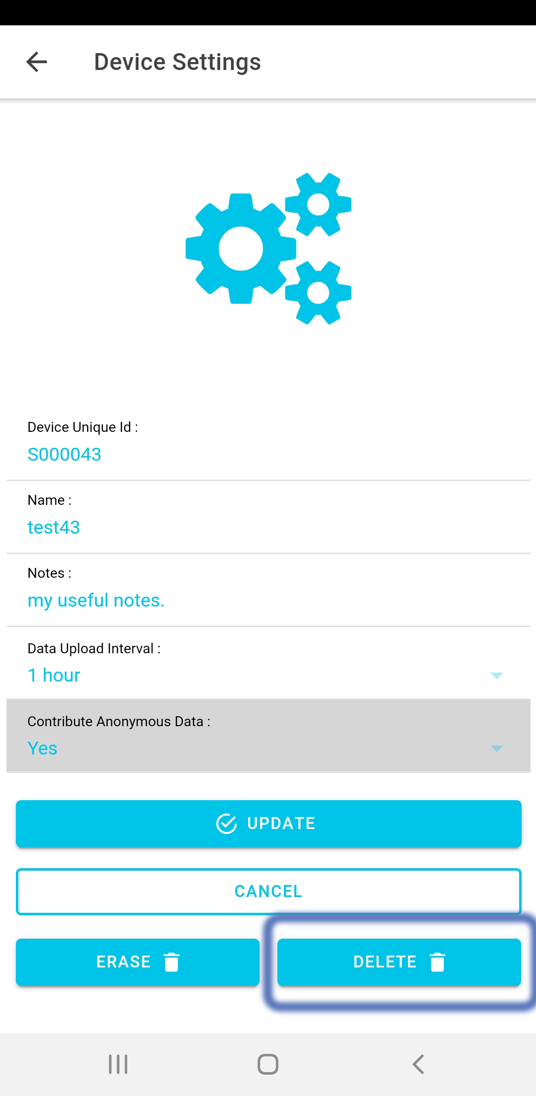
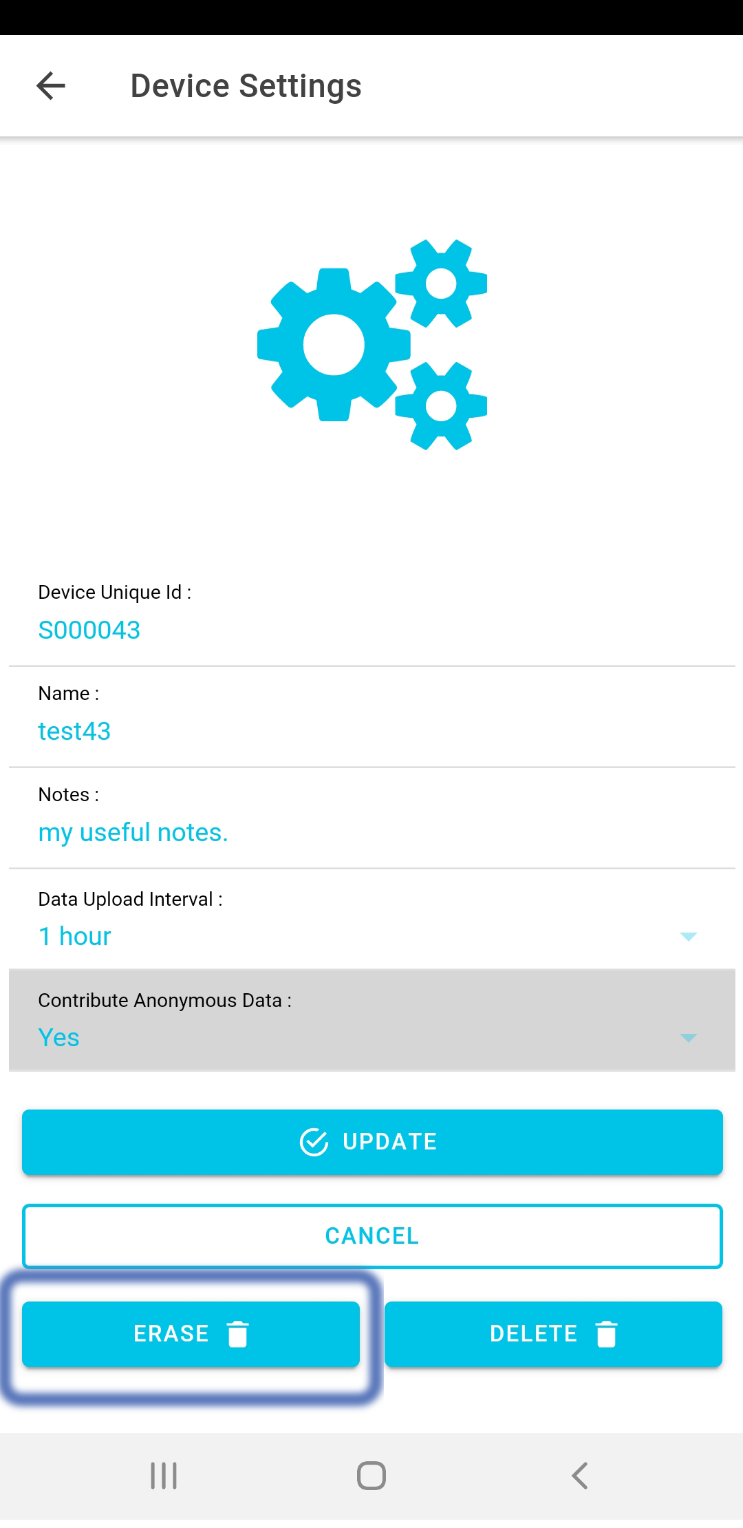
Most of the device and project settings are set during the Add New Device process. But we can modify any of these details if necessary. From the device page, open the ≡ menu. To modify the Device Settings, select that page from the ≡ menu. To delete a device from your account, click "Delete". This does not affect the data for the device. If you do want to erase all the stored data for a device, click "Erase". This will remove all recorded data for the device, but leave the device registered to your account.
Manage Jobs
In order to perform before and after analyses of each space, we have added the Jobs page. This allows you to record when upgrades have been made to your school, details of what you did, when you did it and whether it was applied to every classroom at the school. This data is used downstream in the reporting analysis software to perform advanced before and after analyses.
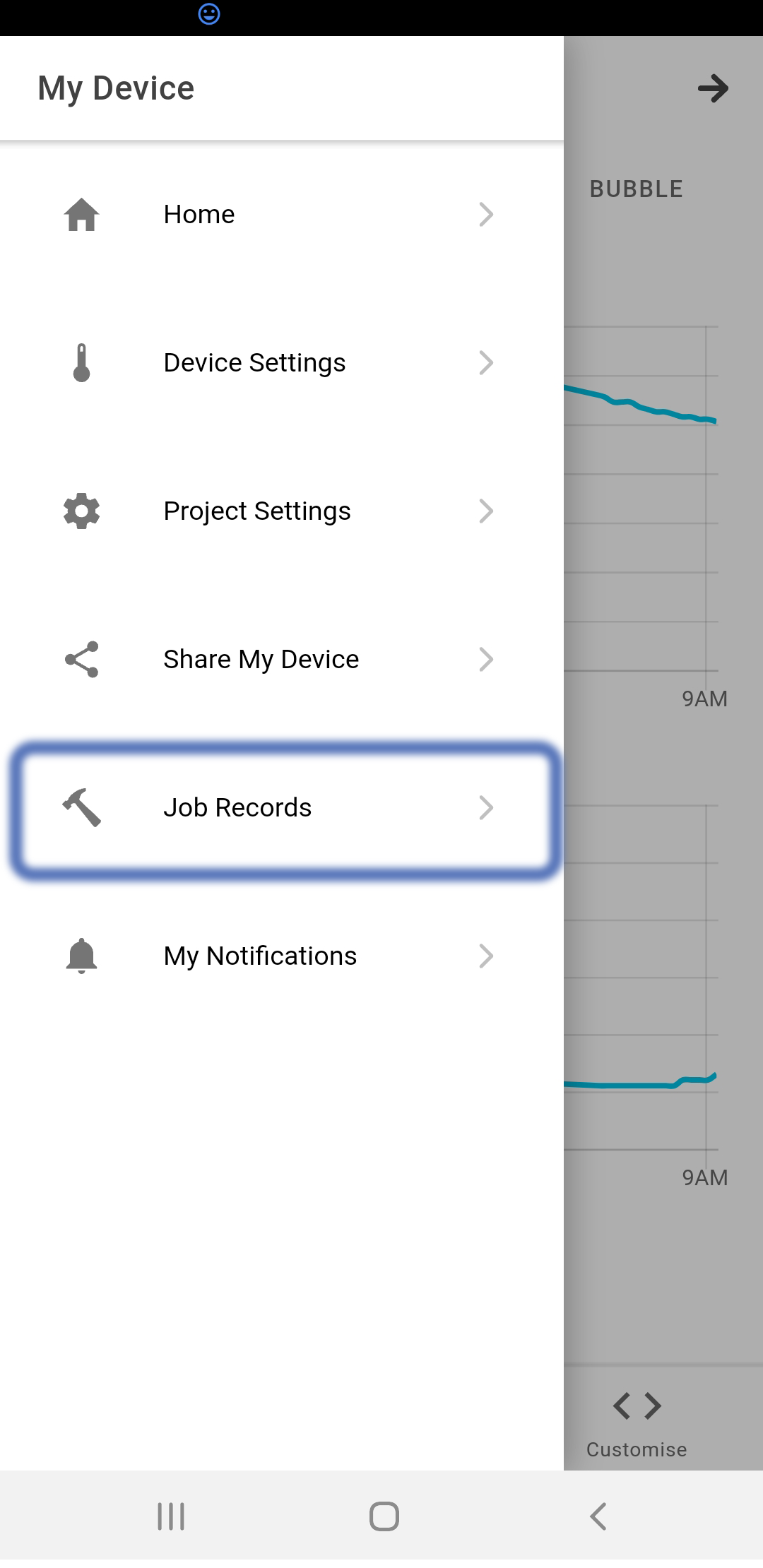
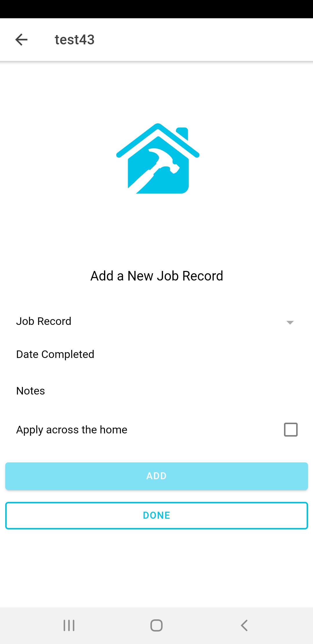
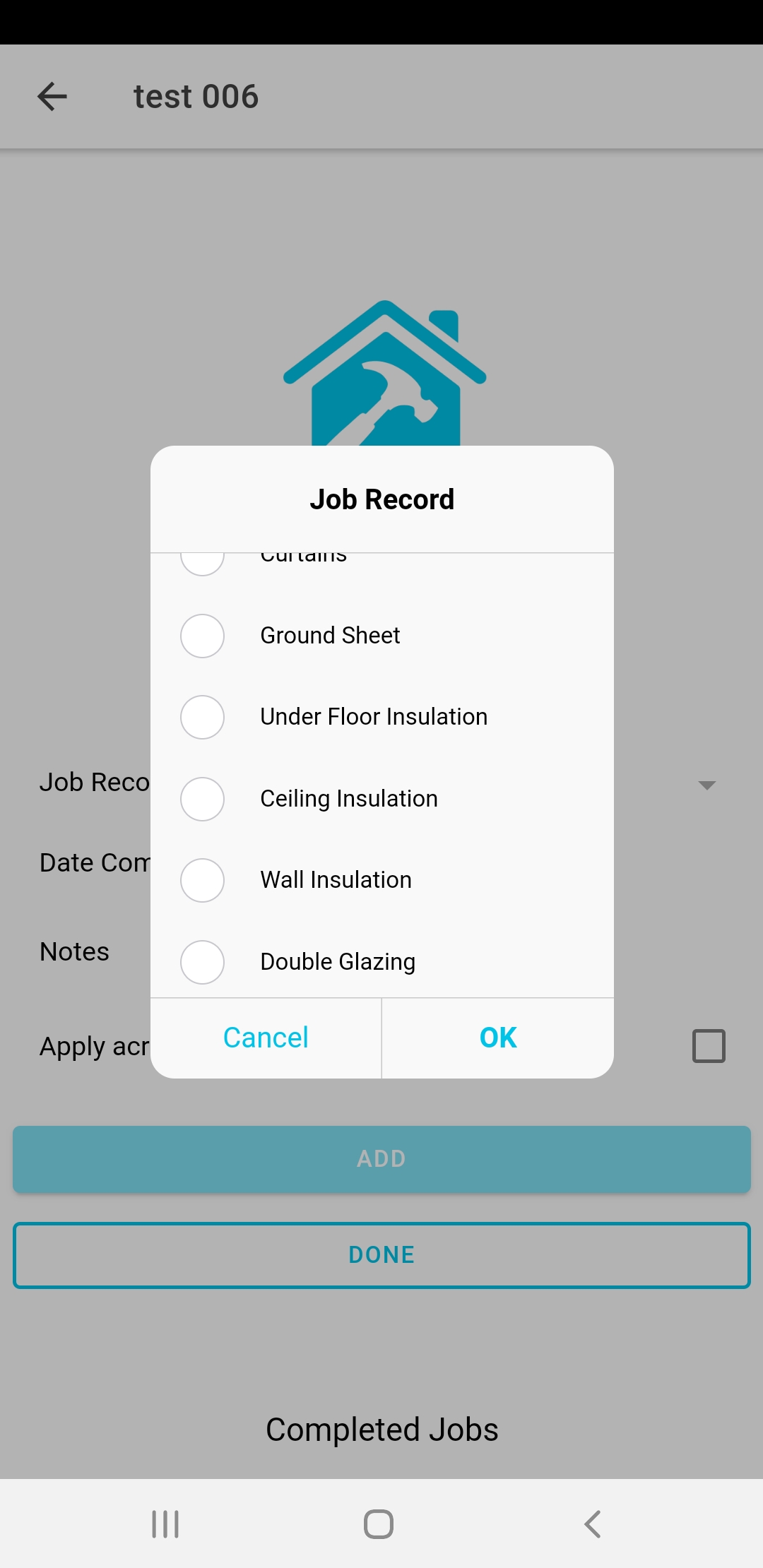
Inside the reporting software, we can access all of this information to carry out detailed analysis of interventions and impact assessments.
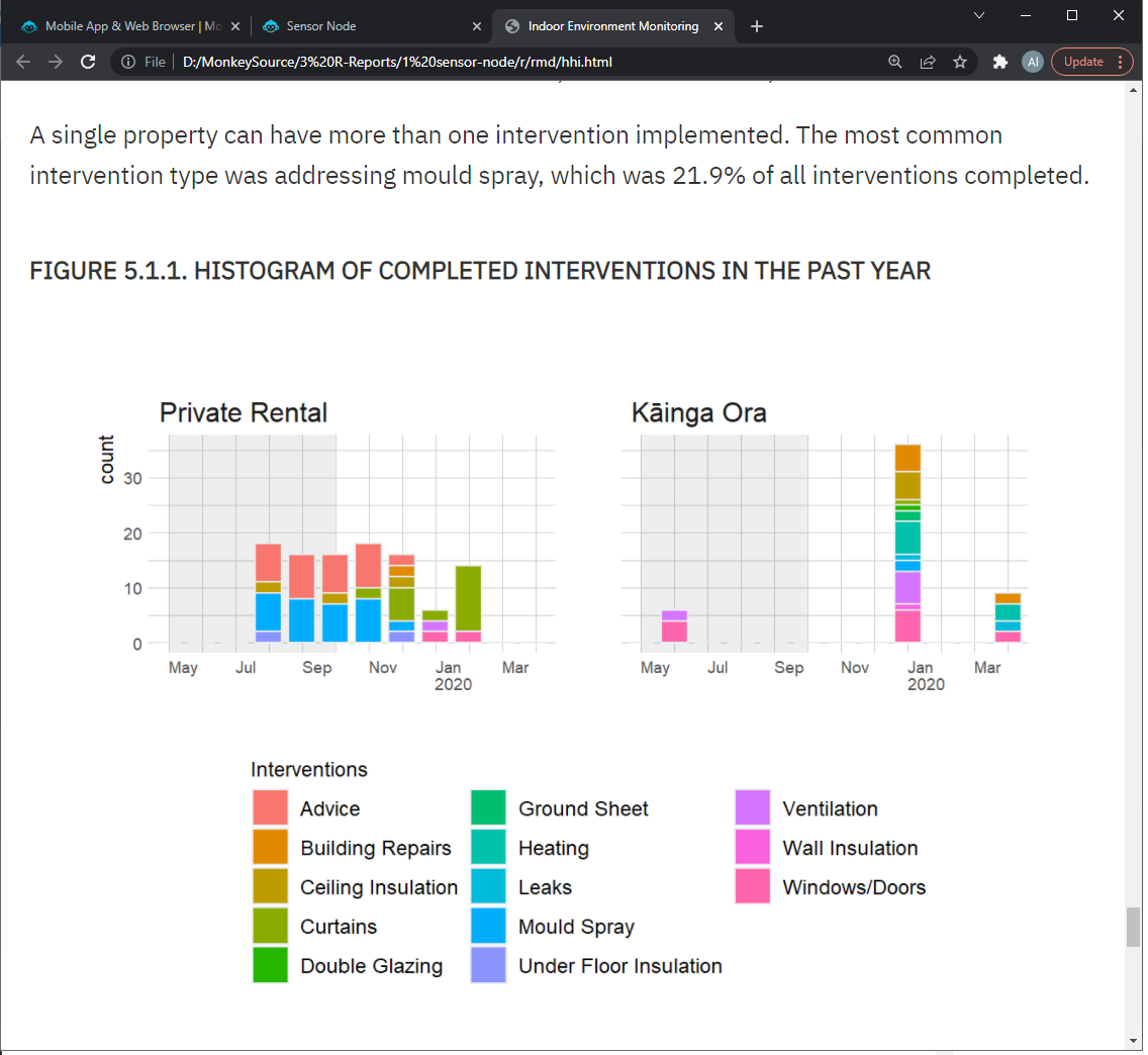
Figure a : Indoor - Outdoor Correlation Analaysis
Notifications
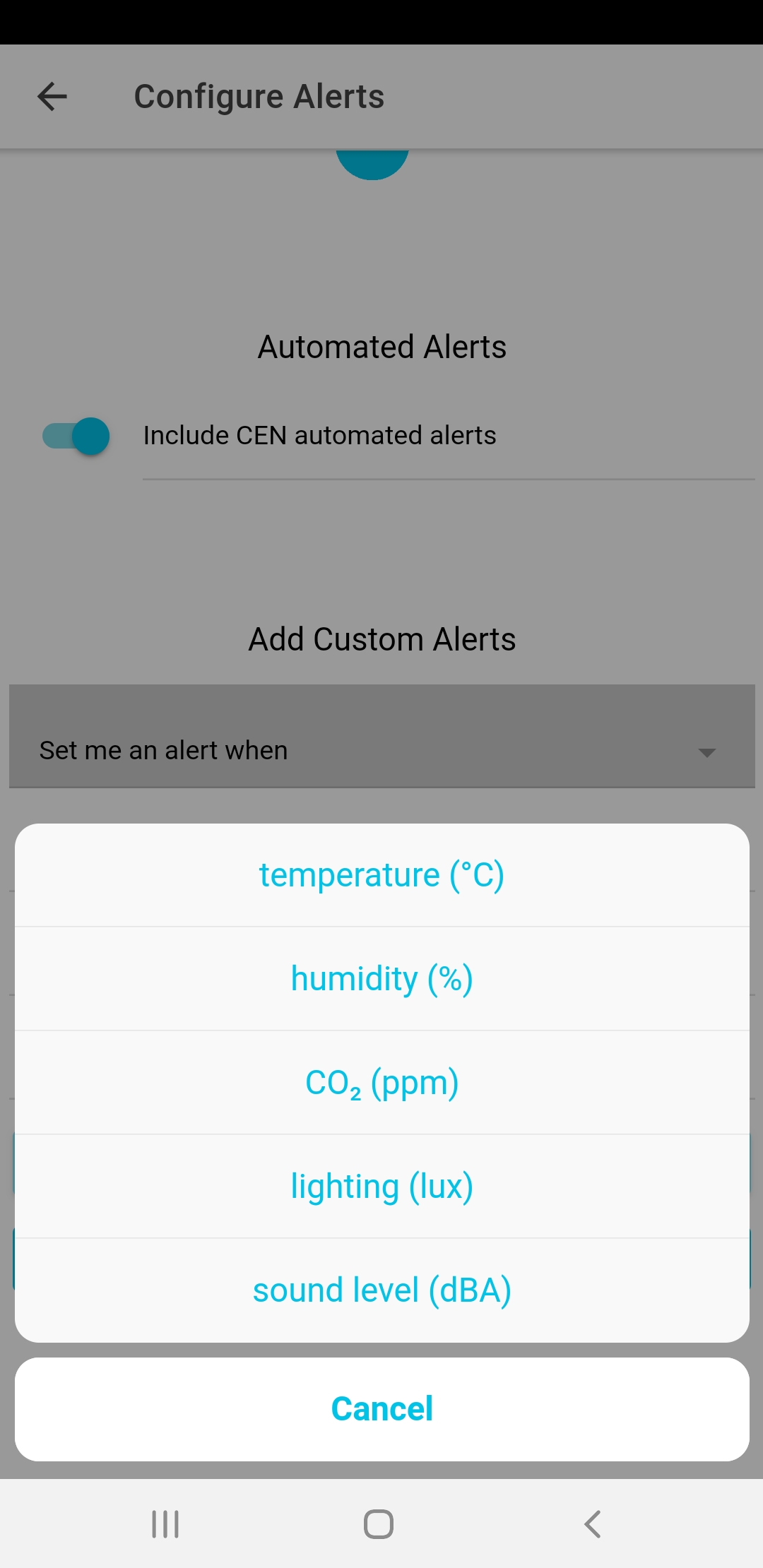
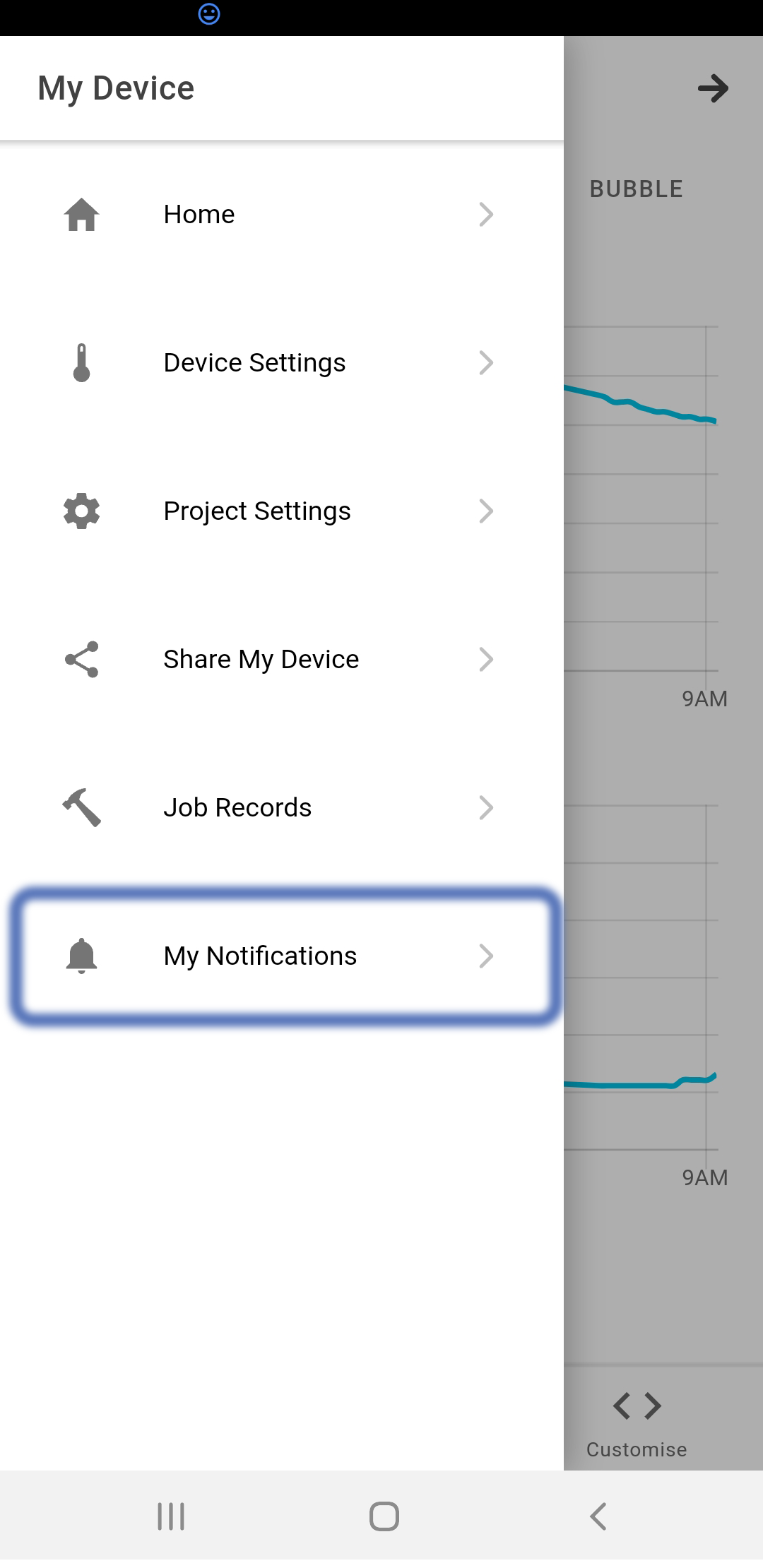
From the Device Page, open the ≡ menu and click on "My Notifications". Inside the notififications page, you can optionally enable the "CEN Automated Alerts". This is a collection of alerts settings and thresholds that were developed in collaboration with the Community Energy Network. These are risk based (as selected in the device project settings).
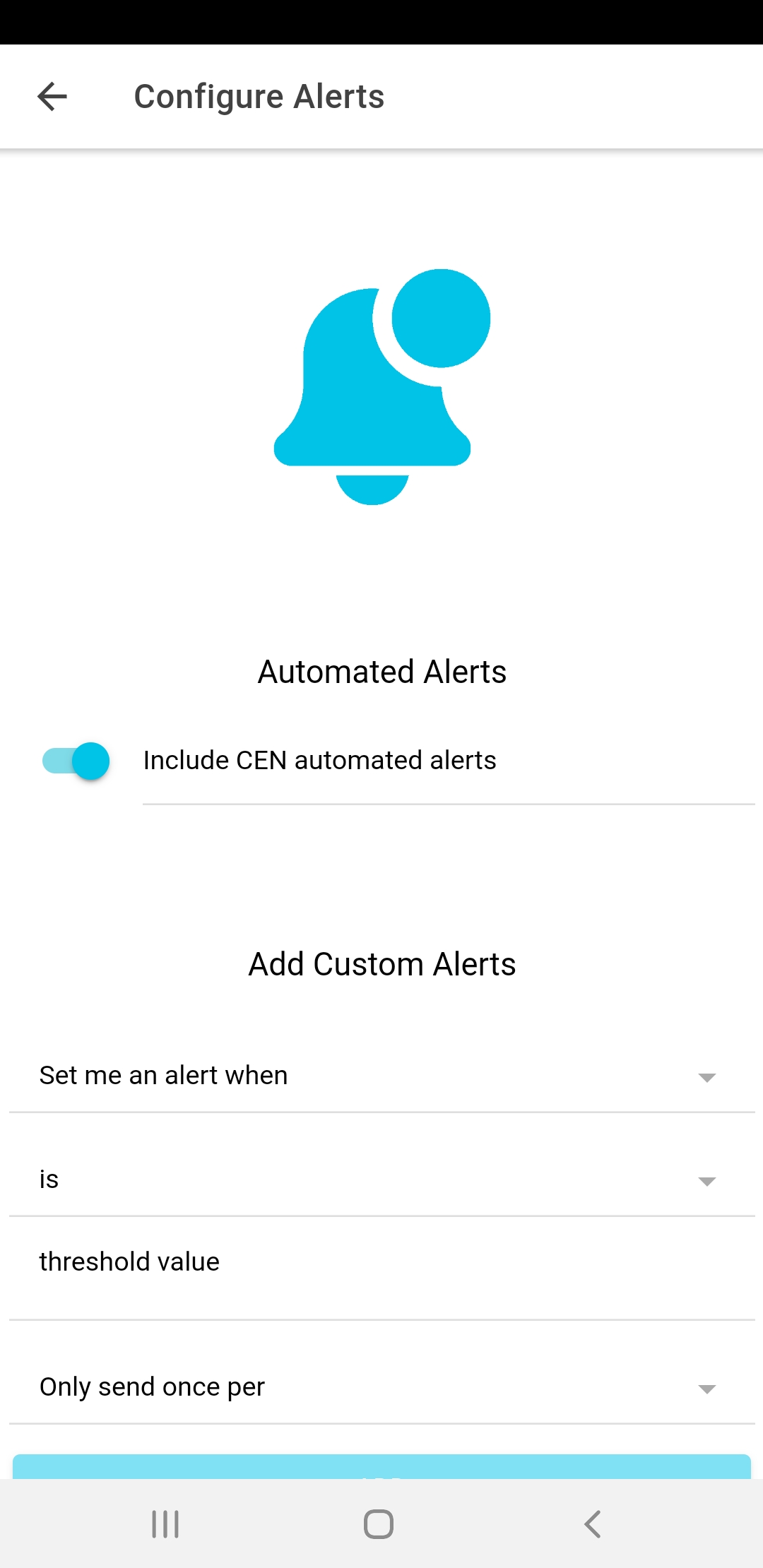
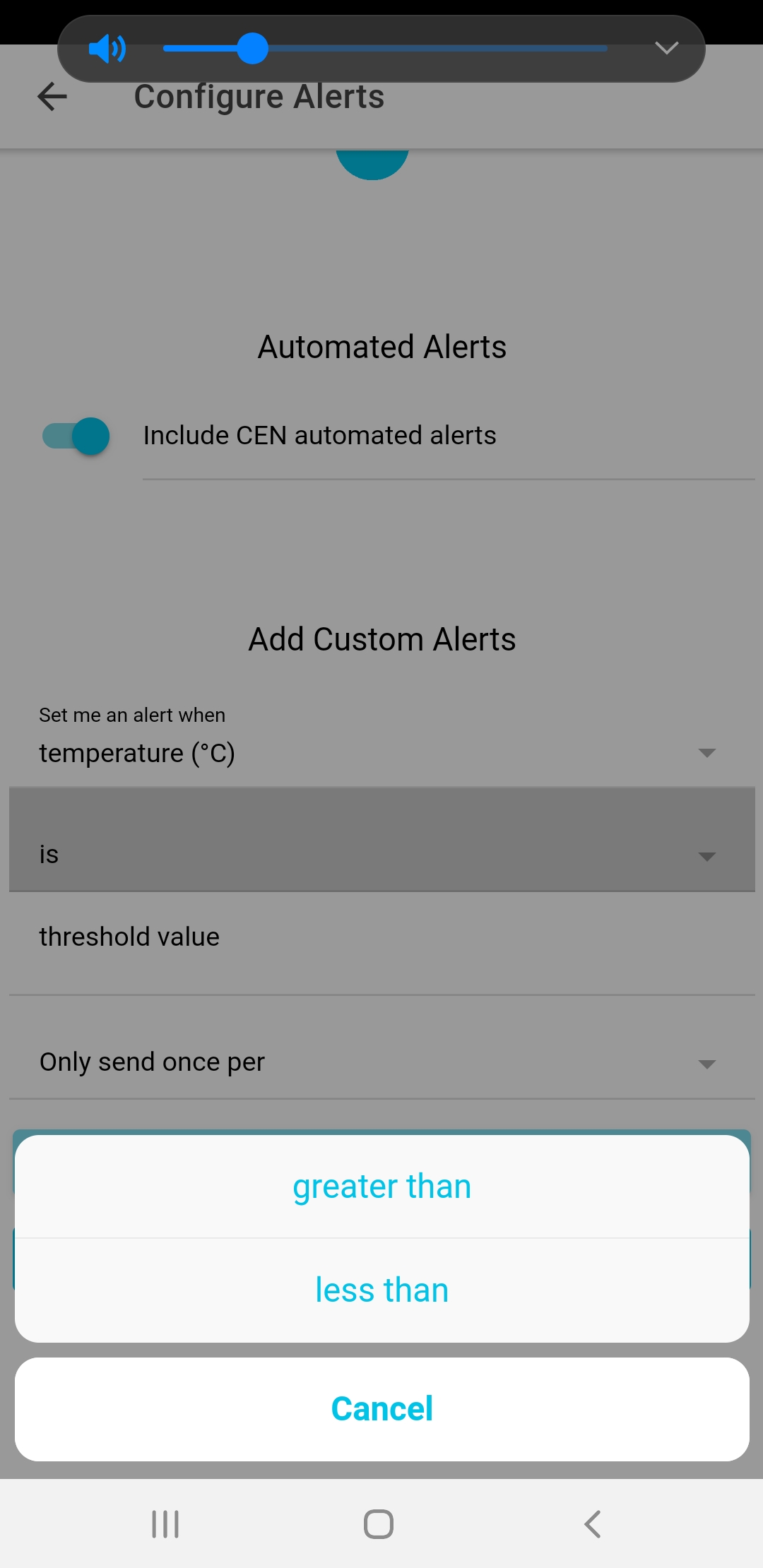
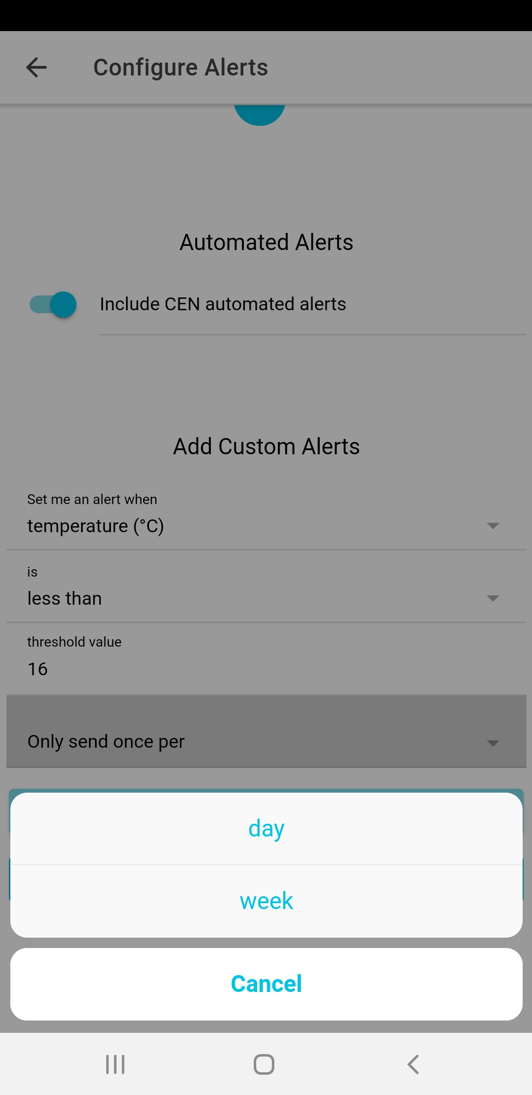
If you want more control over your notifications, you can add them manually, one by one. This allows you granular control of which measurements to act upon, set the thresholds, and choose the frequency of notifications.
